QUESTION IMAGE
Question
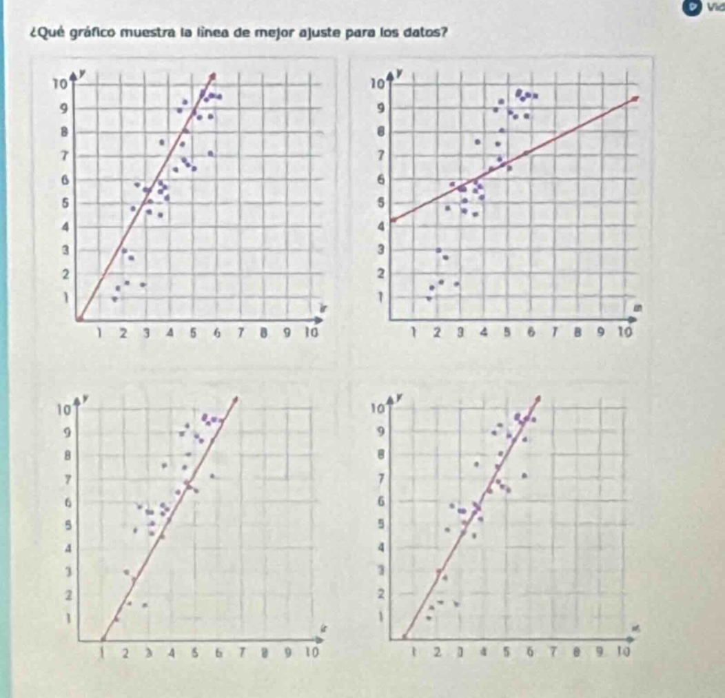
¿qué gráfico muestra la línea de mejor ajuste para los datos?
Response
To determine which graph shows the line of best fit, we analyze the distribution of data points relative to the line:
Step 1: Recall the concept of the line of best fit
The line of best fit (or "linea de mejor ajuste") should balance the number of data points above and below it, with points generally clustered closely around the line (minimizing overall distance from the line).
Step 2: Analyze each graph
- Top-left graph: The line starts at the origin and has many points far from it (e.g., lower-left points are distant).
- Top-right graph: The line has two distinct clusters of points (lower-left and upper-right) with large gaps, so it does not balance the data.
- Bottom-left graph: Points are scattered unevenly, with some far from the line.
- Bottom-right graph: The line balances the number of points above and below it, and most points are clustered closely around the line (minimizing vertical/horizontal distance).

Snap & solve any problem in the app
Get step-by-step solutions on Sovi AI
Photo-based solutions with guided steps
Explore more problems and detailed explanations
The bottom-right graph (fourth graph) shows the line of best fit.