QUESTION IMAGE
Question
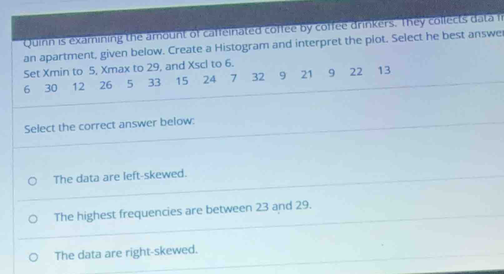
quinn is examining the amount of caffeinated coffee by coffee drinkers. they collects data in an apartment, given below. create a histogram and interpret the plot. select he best answer set xmin to 5, xmax to 29, and xscl to 6. 6 30 12 26 5 33 15 24 7 32 9 21 9 22 13 select the correct answer below: the data are left - skewed. the highest frequencies are between 23 and 29. the data are right - skewed.
Step1: Identify the data points
The data points are: 6, 30, 12, 26, 5, 33, 15, 24, 7, 32, 9, 21, 9, 22, 13.
Step2: Determine the classes based on Xmin, Xmax, and Xscl
Xmin = 5, Xmax = 29, Xscl = 6. So the classes are:
- Class 1: 5 - 11 (5 ≤ x < 11)
- Class 2: 11 - 17 (11 ≤ x < 17)
- Class 3: 17 - 23 (17 ≤ x < 23)
- Class 4: 23 - 29 (23 ≤ x < 29)
Step3: Count the frequency of each class
- Class 1 (5 - 11): Data points 6, 5, 7, 9, 9. Frequency = 5.
- Class 2 (11 - 17): Data points 12, 15, 13. Frequency = 3.
- Class 3 (17 - 23): Data points 21, 22. Frequency = 2.
- Class 4 (23 - 29): Data points 26, 24. Frequency = 2.
Step4: Analyze the skewness
Right - skewed data has a longer tail on the right (higher values). But our Xmax is 29, and data points 30, 32, 33 are outside the Xmax range (maybe a typo or we consider the main data within 5 - 29). Within 5 - 29, the lower class (5 - 11) has the highest frequency. But when we consider the data points outside (30, 32, 33), which are higher values, the tail on the right is longer. Wait, no, the Xmax is set to 29, so maybe we ignore 30, 32, 33? Wait, the problem says "Set Xmin to 5, Xmax to 29, and Xscl to 6". So we consider data within 5 - 29. The data within 5 - 29: 6, 12, 26, 5, 15, 24, 7, 9, 21, 9, 22, 13. Wait, I missed some earlier. Let's re - list data within 5 - 29: 5, 6, 7, 9, 9, 12, 13, 15, 21, 22, 24, 26. Now classes:
- 5 - 11: 5, 6, 7, 9, 9 → 5
- 11 - 17: 12, 13, 15 → 3
- 17 - 23: 21, 22 → 2
- 23 - 29: 24, 26 → 2
Now, the data points 30, 32, 33 are above 29, so they are outliers on the right. But the main data (5 - 29) has the highest frequency in the lowest class. But when we include the outliers on the right, the distribution has a longer tail on the right. Wait, no, left - skewed has a longer tail on the left. Wait, maybe I made a mistake. Let's check the options:
Option 1: Left - skewed: Left - skewed has more data on the right and a long tail on the left. But our lowest class (5 - 11) has the most data, so tail on the left? No, wait, frequency in 5 - 11 is 5, which is the highest. Then 11 - 17: 3, 17 - 23: 2, 23 - 29: 2. So the peak is on the left, and the tail is on the right (since as we move to higher classes, frequency decreases, but there are data points above 29). Wait, no, the Xmax is 29, so the data above 29 are outside the histogram's x - axis. So within the histogram (5 - 29), the frequency decreases as we move to the right. So the tail is on the right, which means right - skewed? Wait, no: Right - skewed (positive skew) has mean > median, and the tail is on the right (higher values). Left - skewed (negative skew) has mean < median, tail on the left (lower values).
Let's calculate median: Data within 5 - 29 (sorted): 5, 6, 7, 9, 9, 12, 13, 15, 21, 22, 24, 26. There are 12 data points. Median is the average of 6th and 7th terms: (12 + 13)/2 = 12.5.
Mean: (5 + 6 + 7 + 9 + 9 + 12 + 13 + 15 + 21 + 22 + 24 + 26)/12 = (5+6=11; 11 + 7 = 18; 18+9=27; 27+9=36; 36+12=48; 48+13=61; 61+15=76; 76+21=97; 97+22=119; 119+24=143; 143+26=169)/12 ≈ 14.08.
Mean (14.08) > Median (12.5), so it is right - skewed.
Now check other options:
Option 2: Highest frequencies between 23 - 29: Frequency here is 2, while in 5 - 11 it is 5. So this is wrong.
Option 1: Left - skewed: We saw mean > median, so it's right - skewed, so this is wrong.
So the correct option is "The data are right - skewed."

Snap & solve any problem in the app
Get step-by-step solutions on Sovi AI
Photo-based solutions with guided steps
Explore more problems and detailed explanations
The data are right - skewed.