QUESTION IMAGE
Question
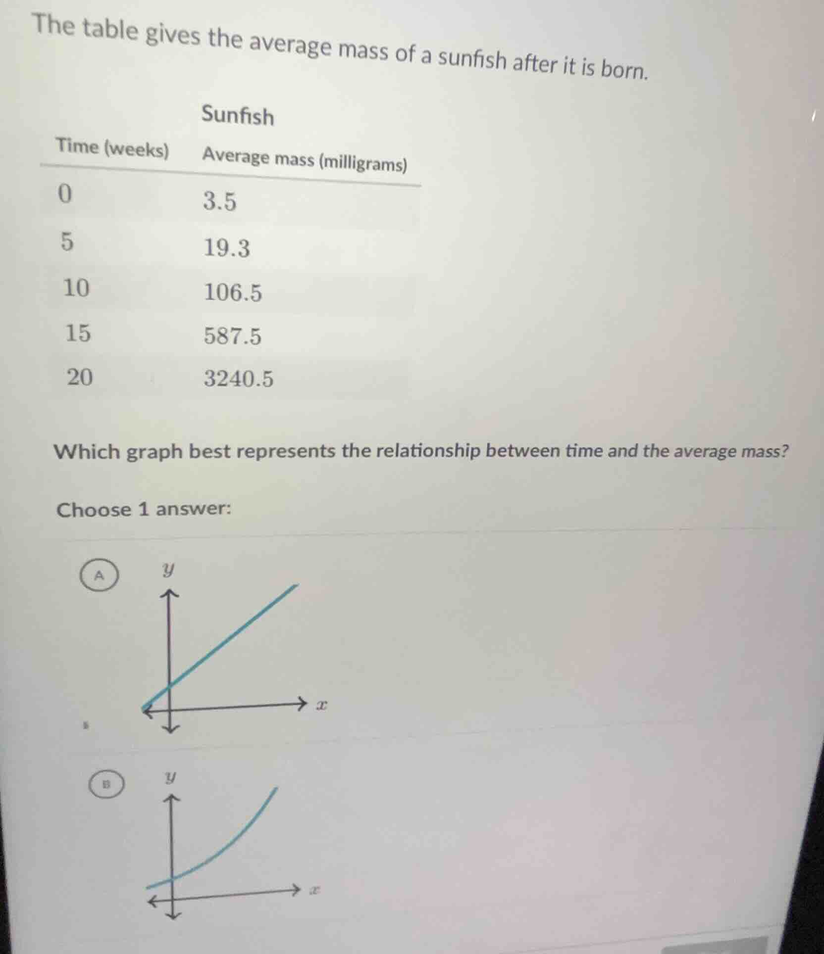
the table gives the average mass of a sunfish after it is born.
sunfish
time (weeks) average mass (milligrams)
0 3.5
5 19.3
10 106.5
15 587.5
20 3240.5
which graph best represents the relationship between time and the average mass?
choose 1 answer:
Step1: Identify growth type
First, calculate the ratio of each mass to the prior one:
$\frac{19.3}{3.5} \approx 5.51$, $\frac{106.5}{19.3} \approx 5.52$, $\frac{587.5}{106.5} \approx 5.52$, $\frac{3240.5}{587.5} \approx 5.52$.
The mass grows by a nearly constant multiplicative factor, meaning it is exponential growth, not linear.
Step2: Match to graph
Linear growth (Graph A) has a constant additive increase, while exponential growth (Graph B) has an increasing rate of change, curving upward.

Snap & solve any problem in the app
Get step-by-step solutions on Sovi AI
Photo-based solutions with guided steps
Explore more problems and detailed explanations
B. <The upward-curving exponential graph>