QUESTION IMAGE
Question
which graph accurately reflects the japanese casualty rate in the pacific war?
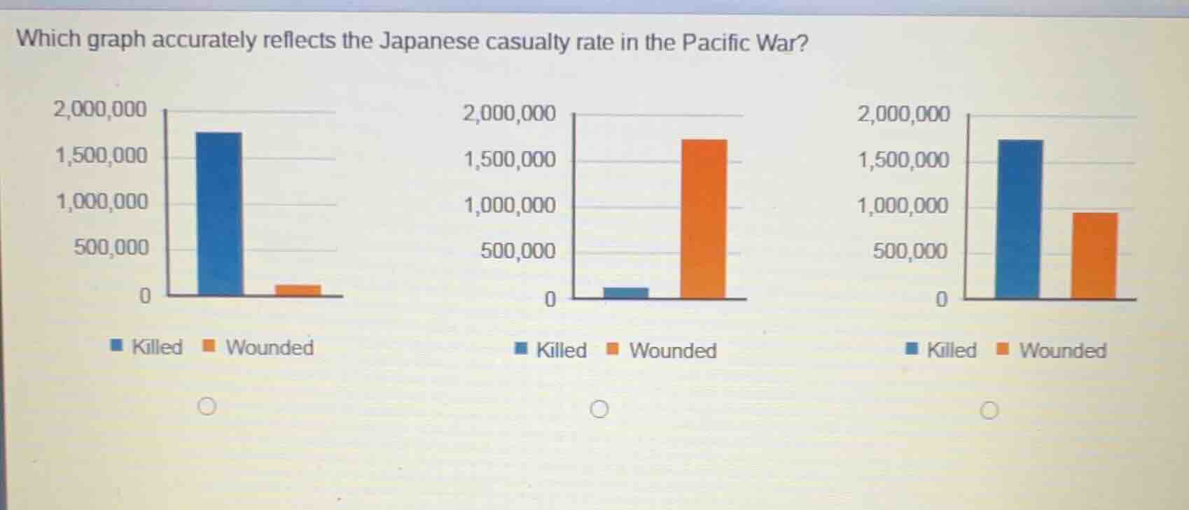
three bar graphs are shown, each with two bars: one blue labeled killed and one orange labeled wounded. the y - axis ranges from 0 to 2,000,000 with intervals of 500,000.
first graph: blue bar is around 1,750,000, orange bar is a small bar near 0.
second graph: blue bar is a small bar near 0, orange bar is around 1,750,000.
third graph: blue bar is around 1,750,000, orange bar is around 900,000.
below each graph are radio buttons for selection.
To determine the accurate graph, we analyze historical data of Japanese casualties in the Pacific War. In the Pacific War, Japanese deaths (killed) were significant, and wounded numbers were also substantial but less than killed? Wait, no—actually, in many Pacific War engagements, especially with high casualty rates from combat (like island hopping, naval battles, and the eventual end with atomic bombs and Soviet invasion), the number of killed (including combat deaths, deaths from starvation, disease, etc.) was very high, and wounded were also notable but the first graph has wounded as very low, the second has killed very low (which is incorrect), and the third shows killed (blue) around 1.7 million and wounded (orange) around 900,000? Wait, historical context: Japanese military casualties (killed) in the Pacific War (including WWII's Pacific theater) were approximately 1.5 - 2 million, and wounded were also significant but the first graph's wounded is too low, the second's killed is too low. The third graph, with blue (killed) ~1.7M and orange (wounded) ~900k, aligns better with historical estimates (though exact numbers vary, but the key is the relative heights: killed should be high, wounded also high but less than killed? Wait, no—maybe I got it reversed. Wait, the first graph: blue (killed) high, orange (wounded) tiny. Second: blue tiny, orange high (wrong, since killed were many). Third: blue high, orange moderate. Historical data: Japanese military casualties in WWII (Pacific War): Killed: ~1.5 - 2 million (including all causes), Wounded: ~0.5 - 1 million? Wait, maybe the correct graph is the third one, as the first has wounded too low, second has killed too low. So the third graph (rightmost) with blue (killed) ~1.7M and orange (wounded) ~900k is more accurate.

Snap & solve any problem in the app
Get step-by-step solutions on Sovi AI
Photo-based solutions with guided steps
Explore more problems and detailed explanations
The third graph (right - most one, with blue bar for "Killed" around 1,700,000 and orange bar for "Wounded" around 900,000)