QUESTION IMAGE
Question
challenge activity 1.2.2 misleading graphs.
770446 1810972 p0may?
jump to level 1
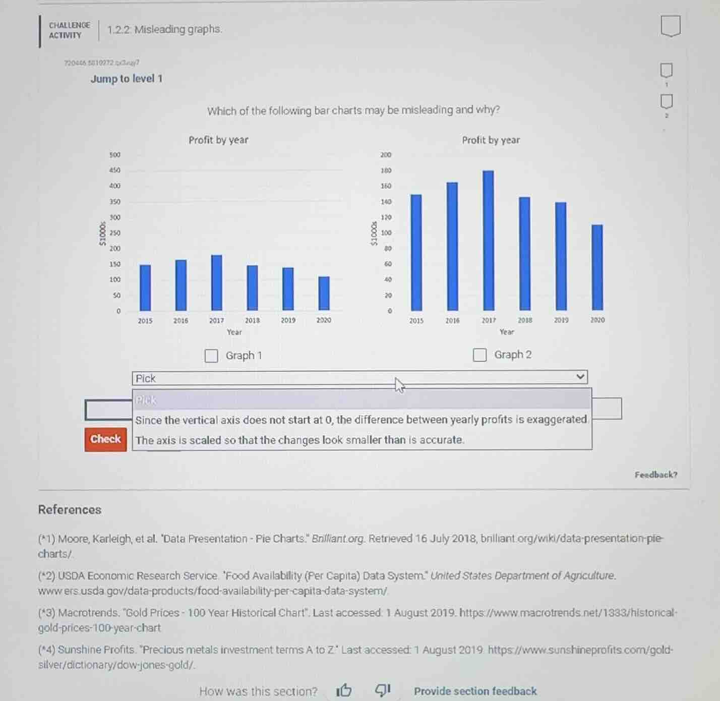
which of the following bar charts may be misleading and why?
profit by year
profit by year
500
200
450
180
400
160
350
140
300
120
250
100
200
80
150
60
100
40
50
20
0
2015 2016 2017 2018 2019 2020
year
0
2015 2016 2017 2018 2019 2020
year
graph 1
graph 2
pick
pick
since the vertical axis does not start at 0, the difference between yearly profits is exaggerated
check
the axis is scaled so that the changes look smaller than is accurate.
feedback?
references
(*1) moore, karleigh, et al. \data presentation - pie charts.\ brilliant.org. retrieved 16 july 2018, brilliant.org/wiki/data-presentation-pie-charts/.
(*2) usda economic research service. \food availability (per capita) data system\ united states department of agriculture. www.ers.usda.gov/data-products/food-availability-per-capita-data-system/
(*3) macrotrends. \gold prices - 100 year historical chart\. last accessed: 1 august 2019. https://www.macrotrends.net/1383/historical-gold-prices-100-year-chart
(*4) sunshine profits. \precious metals investment terms a to z\ last accessed: 1 august 2019. https://www.sunshineprofits.com/gold-silver/dictionary/dow-jones-gold/.
how was this section? ↑ ❓ provide section feedback

Snap & solve any problem in the app
Get step-by-step solutions on Sovi AI
Photo-based solutions with guided steps
Explore more problems and detailed explanations
Graph 2. Since the vertical axis does not start at 0, the difference between yearly profits is exaggerated