QUESTION IMAGE
Question
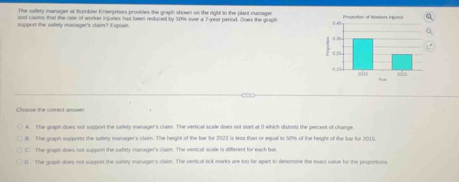
the safety manager at bumbler enterprises provides the graph shown on the right to the plant manager and claims that the rate of worker injuries has been reduced by 50% over a 7 - year period. does the graph support the safety managers claim? explain. choose the correct answer. a. the graph does not support the safety managers claim. the vertical scale does not start at 0 which distorts the percent of change. b. the graph supports the safety managers claim. the height of the bar for 2022 is less than or equal to 50% of the height of the bar for 2015. c. the graph does not support the safety managers claim. the vertical scale is different for each bar. d. the graph does not support the safety managers claim. the vertical tick marks are too far apart to determine the exact value for the proportions.
To determine if the graph supports the 50% reduction claim, we analyze the vertical scale. A bar graph's vertical scale starting at 0 is crucial for accurate percentage change interpretation. Here, the vertical scale starts at 0.15, not 0. For 2015, the proportion is 0.35; for 2022, it's 0.25. The reduction percentage is $\frac{0.35 - 0.25}{0.35} \approx 28.57\%$, not 50%. The distorted scale (not starting at 0) makes the reduction appear larger. Option A correctly identifies this distortion. Option B is wrong as 0.25 is not ≤ 50% of 0.35 (0.175). Option C is wrong as the vertical scale isn't different for each bar. Option D is wrong as the issue is the scale start, not tick mark spacing.

Snap & solve any problem in the app
Get step-by-step solutions on Sovi AI
Photo-based solutions with guided steps
Explore more problems and detailed explanations
A. The graph does not support the safety manager’s claim. The vertical scale does not start at 0 which distorts the percent of change.