QUESTION IMAGE
Question
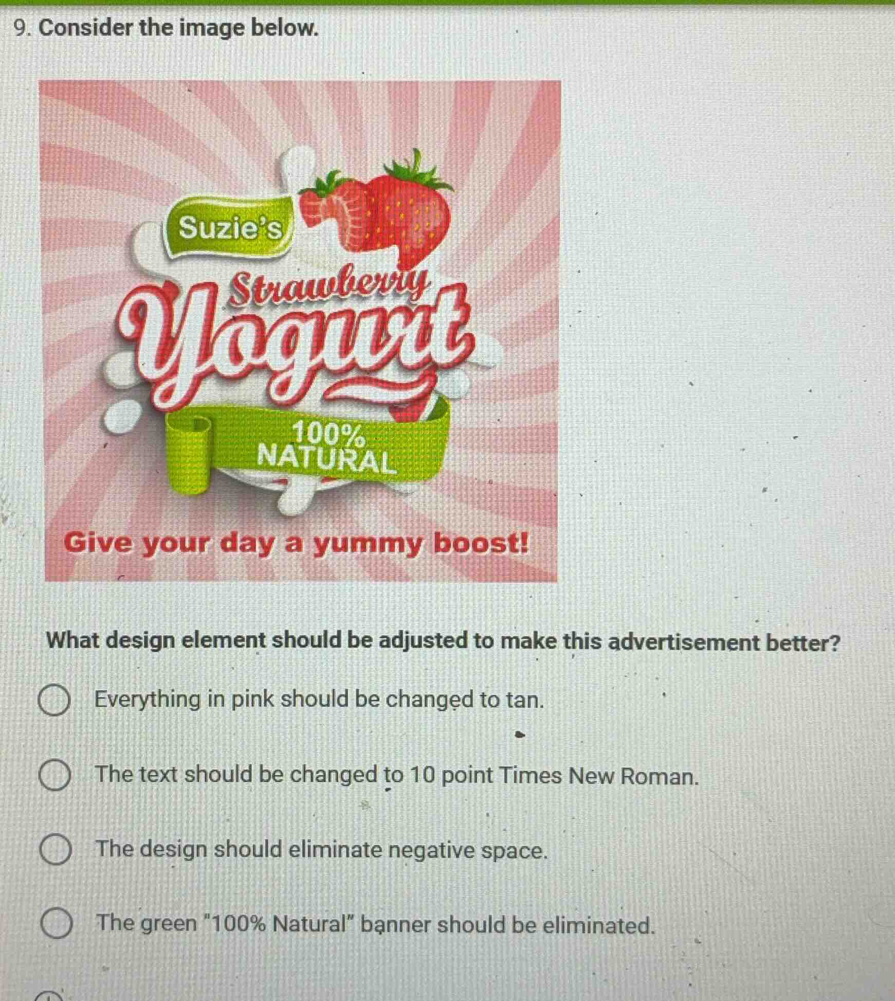
- consider the image below.
what design element should be adjusted to make this advertisement better?
○ everything in pink should be changed to tan.
○ the text should be changed to 10 point times new roman.
○ the design should eliminate negative space.
○ the green \100% natural\ banner should be eliminated.
Brief Explanations
- Option 1: Changing pink to tan is arbitrary and doesn't improve the ad's design logic.
- Option 2: Using 10 - point Times New Roman would make the text hard to read and clash with the playful, colorful ad style.
- Option 3: Eliminating negative space can help in making the design more cohesive and focused, as negative space here might be making the design look unbalanced.
- Option 4: The green “100% Natural” banner is a key selling point and eliminating it would remove important information.

Snap & solve any problem in the app
Get step-by-step solutions on Sovi AI
Photo-based solutions with guided steps
Explore more problems and detailed explanations
The design should eliminate negative space.