QUESTION IMAGE
Question
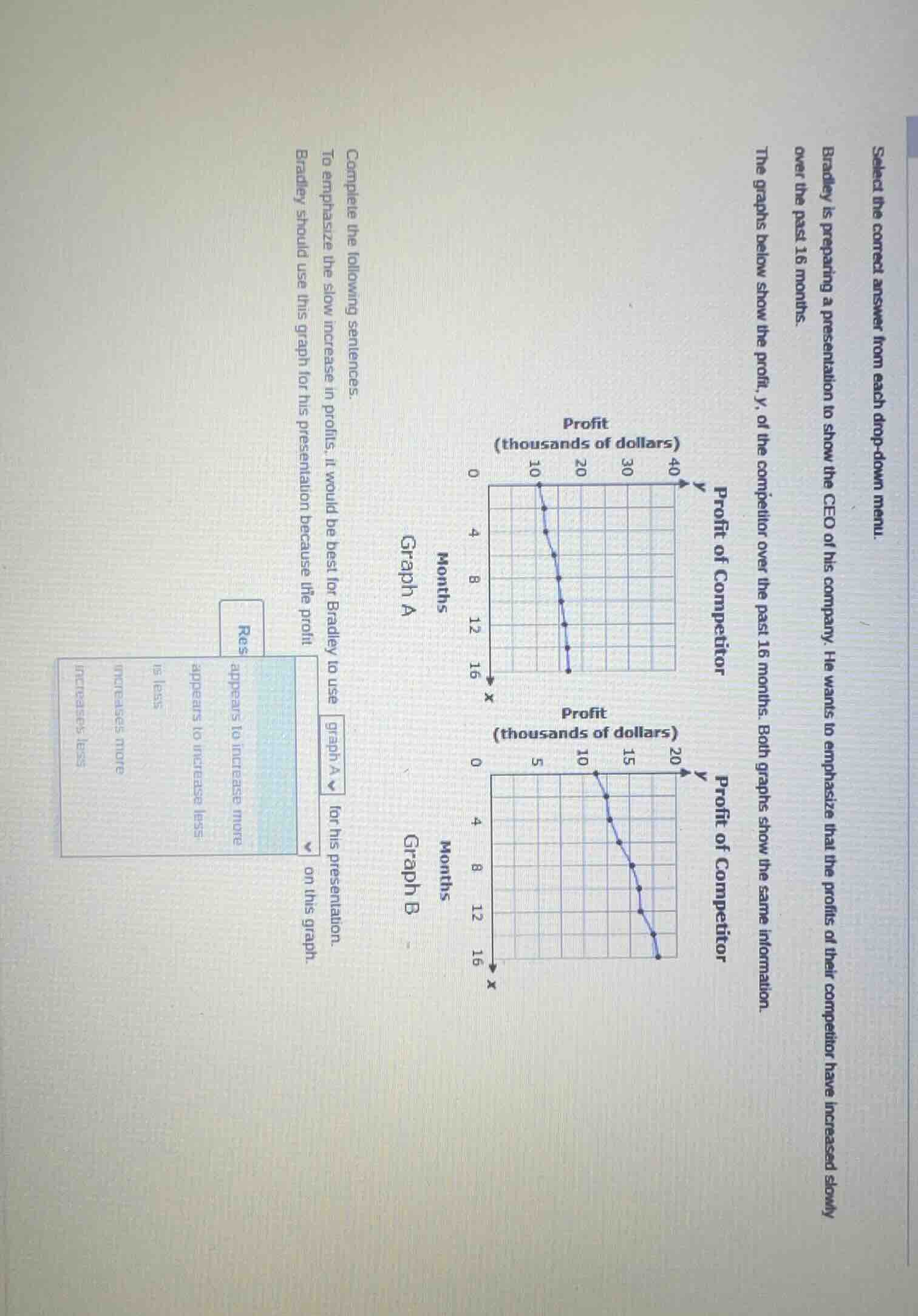
select the correct answer from each drop - down menu. bradley is preparing a presentation to show the ceo of his company. he wants to emphasize that the profits of their competitor have increased slowly over the past 16 months. the graphs below show the profit, y, of the competitor over the past 16 months. both graphs show the same information. complete the following sentences. to emphasize the slow increase in profits, it would be best for bradley to use graph a / graph b for his presentation. bradley should use this graph for his presentation because the profit appears to increase more / appears to increase less / is less / increases more / increases less on this graph.
Step1: Analyze the y - axes of the graphs
Graph A has a y - axis range from 0 to 40 (in thousands of dollars) and Graph B has a y - axis range from 0 to 20 (in thousands of dollars). When we want to emphasize a slow increase (or in this case, since the profit is actually decreasing, to make the decrease seem less steep or the change seem smaller), we look at the scale.
Step2: Determine the effect of the graph scale
If we want to show that the profit "appears to increase less" (or in this case, the decrease appears less severe or the change in profit appears to have a smaller magnitude of change), a larger y - axis scale (like Graph A) will make the slope of the line (representing the change in profit over time) appear less steep. Wait, actually, in this case, the profit is decreasing. But the question is about emphasizing the slow increase (maybe a misstatement, but looking at the graphs, both show a decrease? Wait, no, the first graph (Graph A) starts at 10 (thousand) and goes down, Graph B starts at 10 (thousand) and goes down. Wait, maybe the question has a typo, but let's go with the scales. To make the change (whether increase or decrease) seem smaller, a larger y - scale is used. So if we want to show that the profit "appears to increase less" (or the change in profit is less dramatic), we use Graph A? Wait, no, let's re - evaluate. The first drop - down: to emphasize the slow increase (but the graphs show a decrease? Maybe it's a decrease, but the question says "slow increase". Anyway, the key is the scale. Graph A has a larger y - axis (0 - 40) and Graph B has a smaller y - axis (0 - 20). So on Graph A, the same change in profit (in thousands of dollars) will take up less of the y - axis, making the slope appear less steep (so the increase or decrease appears less). So to emphasize the slow increase (or small change), we use Graph A, and on Graph A, the profit "appears to increase less" (or the change in profit appears to have a smaller rate of change).

Snap & solve any problem in the app
Get step-by-step solutions on Sovi AI
Photo-based solutions with guided steps
Explore more problems and detailed explanations
To emphasize the slow increase in profits, it would be best for Bradley to use \(\boldsymbol{\text{graph A}}\) for his presentation because the profit \(\boldsymbol{\text{appears to increase less}}\) on this graph.