QUESTION IMAGE
Question
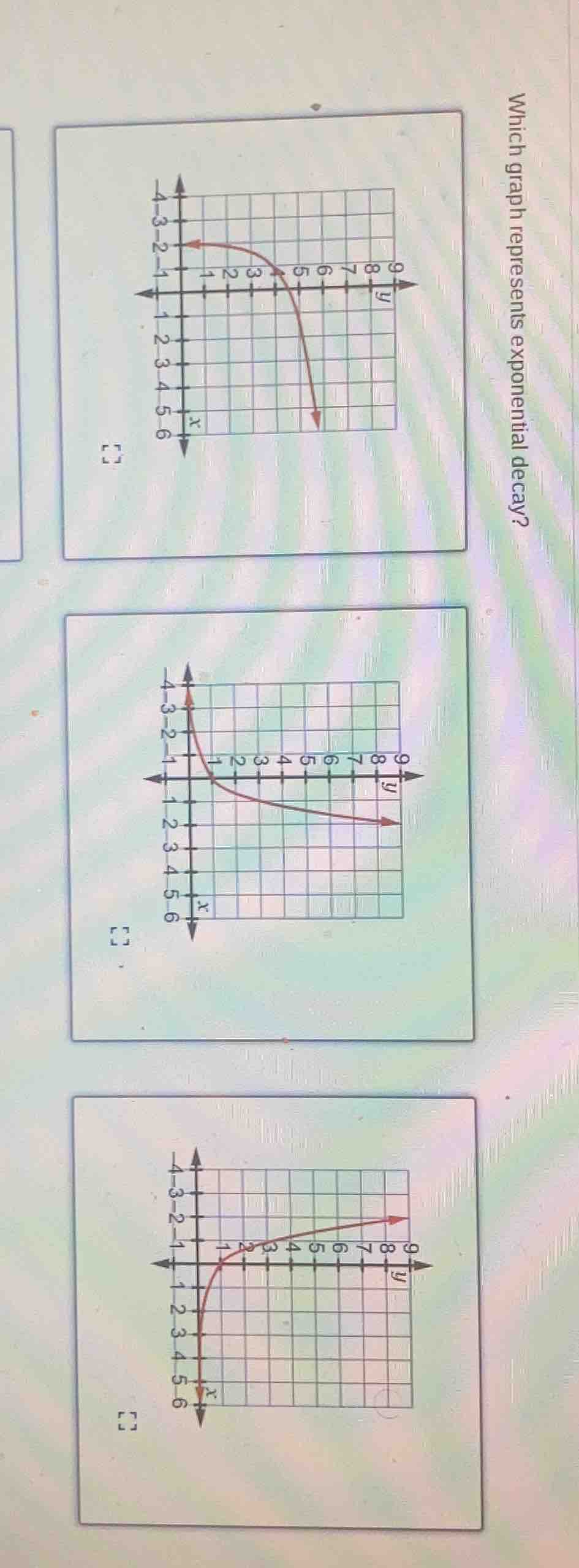
which graph represents exponential decay?
Brief Explanations
Exponential decay graphs show a function where as the independent variable $x$ increases, the dependent variable $y$ decreases, approaching 0 but never reaching it, with a decreasing rate of change.
- The top graph: As $x$ increases, $y$ decreases, matching exponential decay.
- The middle graph: As $x$ increases, $y$ approaches a positive value, not decay.
- The bottom graph: As $x$ increases, $y$ increases, which is exponential growth.

Snap & solve any problem in the app
Get step-by-step solutions on Sovi AI
Photo-based solutions with guided steps
Explore more problems and detailed explanations
The top graph (the first graph shown, where $y$ decreases as $x$ increases starting from a high $y$-value) represents exponential decay.