QUESTION IMAGE
Question
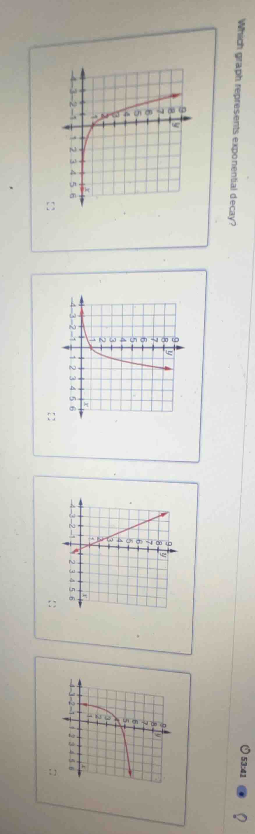
which graph represents exponential decay?
Brief Explanations
Exponential decay graphs show a function where as the independent variable $x$ increases, the dependent variable $y$ decreases, approaching 0, and has a curved (not linear) shape.
- The first graph shows $y$ increasing as $x$ increases (exponential growth).
- The second graph shows $y$ decreasing as $x$ increases, with a curved shape matching exponential decay.
- The third graph is a straight line (linear function, not exponential).
- The fourth graph shows $y$ increasing rapidly as $x$ increases (exponential growth).

Snap & solve any problem in the app
Get step-by-step solutions on Sovi AI
Photo-based solutions with guided steps
Explore more problems and detailed explanations
The second graph (the one where the curve starts high on the left near negative $x$-values, decreases as $x$ increases, and approaches the positive $x$-axis)