QUESTION IMAGE
Question
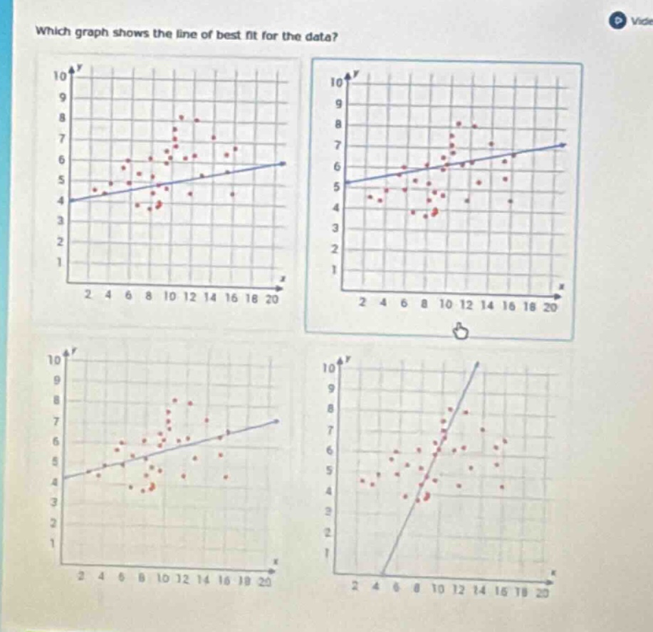
which graph shows the line of best fit for the data? (four scatter plots with lines are shown, as described in the image)
Response
To determine the line of best fit, we analyze the scatter plots:
Step 1: Understand the Line of Best Fit
The line of best fit should minimize the distance between itself and all data points (red dots) and reflect the overall trend (positive/ negative) of the data.
Step 2: Analyze Each Graph
- Top - Left Graph: The line starts at \( y = 4 \) and has a shallow slope. The data points are clustered around a trend, but check other options.
- Top - Right Graph: The line starts at \( y = 5 \) and has a shallow slope. The data points are more evenly distributed around this line, matching the positive trend of the scatter plot.
- Bottom - Left Graph: The line is steeper than the top - right and does not align as well with the cluster of points (especially the lower - left points).
- Bottom - Right Graph: The line is very steep and does not reflect the gradual positive trend of the data (most points are not close to this steep line).
The top - right graph’s line best balances the distribution of data points around it, capturing the overall positive trend.

Snap & solve any problem in the app
Get step-by-step solutions on Sovi AI
Photo-based solutions with guided steps
Explore more problems and detailed explanations
The graph in the top - right (with the line starting near \( y = 5 \) and rising gently) shows the line of best fit.