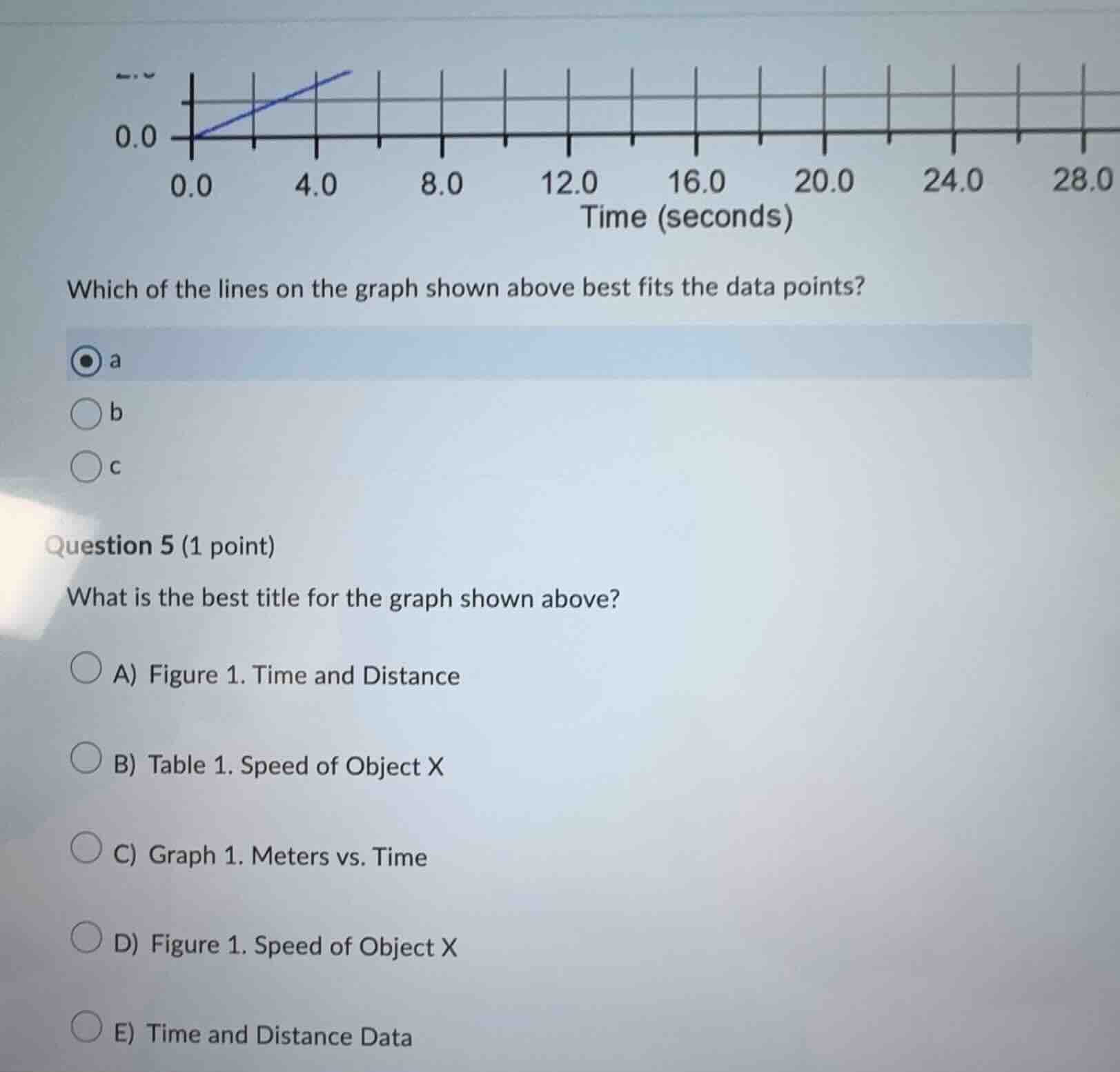
QUESTION IMAGE
Question
which of the lines on the graph shown above best fits the data points?
a
b
c
question 5 (1 point)
what is the best title for the graph shown above?
a) figure 1. time and distance
b) table 1. speed of object x
c) graph 1. meters vs. time
d) figure 1. speed of object x
e) time and distance data
First Question (Which line best fits):
To determine the best - fitting line, we analyze the data points (implied by the graph's context, likely distance - time as the y - axis seems related to distance and x - axis is time). Line 'a' passes through the origin (0,0) and has a slope that aligns with the trend of the data points. Line 'b' is horizontal, which would imply no change over time (unlikely for a motion - related graph). Line 'c' is also horizontal. So line 'a' best fits the data points.
- Option A: "Time and Distance" is too vague as it doesn't specify the graph type or the object.
- Option B: It's a graph, not a table, so "Table 1" is incorrect.
- Option C: "Graph 1. Meters vs. Time" is a good description as the x - axis is time (seconds) and the y - axis is likely distance (in meters, implied by the context of motion). It clearly identifies the graph, the variables (meters and time), and their relationship.
- Option D: The graph shows a relationship between distance (or position) and time, not directly speed. Speed is the slope, but the graph's axes are more about distance - time.
- Option E: "Time and Distance Data" is not a proper title for a graph; it's more suitable for a data set description.

Snap & solve any problem in the app
Get step-by-step solutions on Sovi AI
Photo-based solutions with guided steps
Explore more problems and detailed explanations
a