QUESTION IMAGE
Question
a) 15 b) hours c) growth (cm) d) plant growth
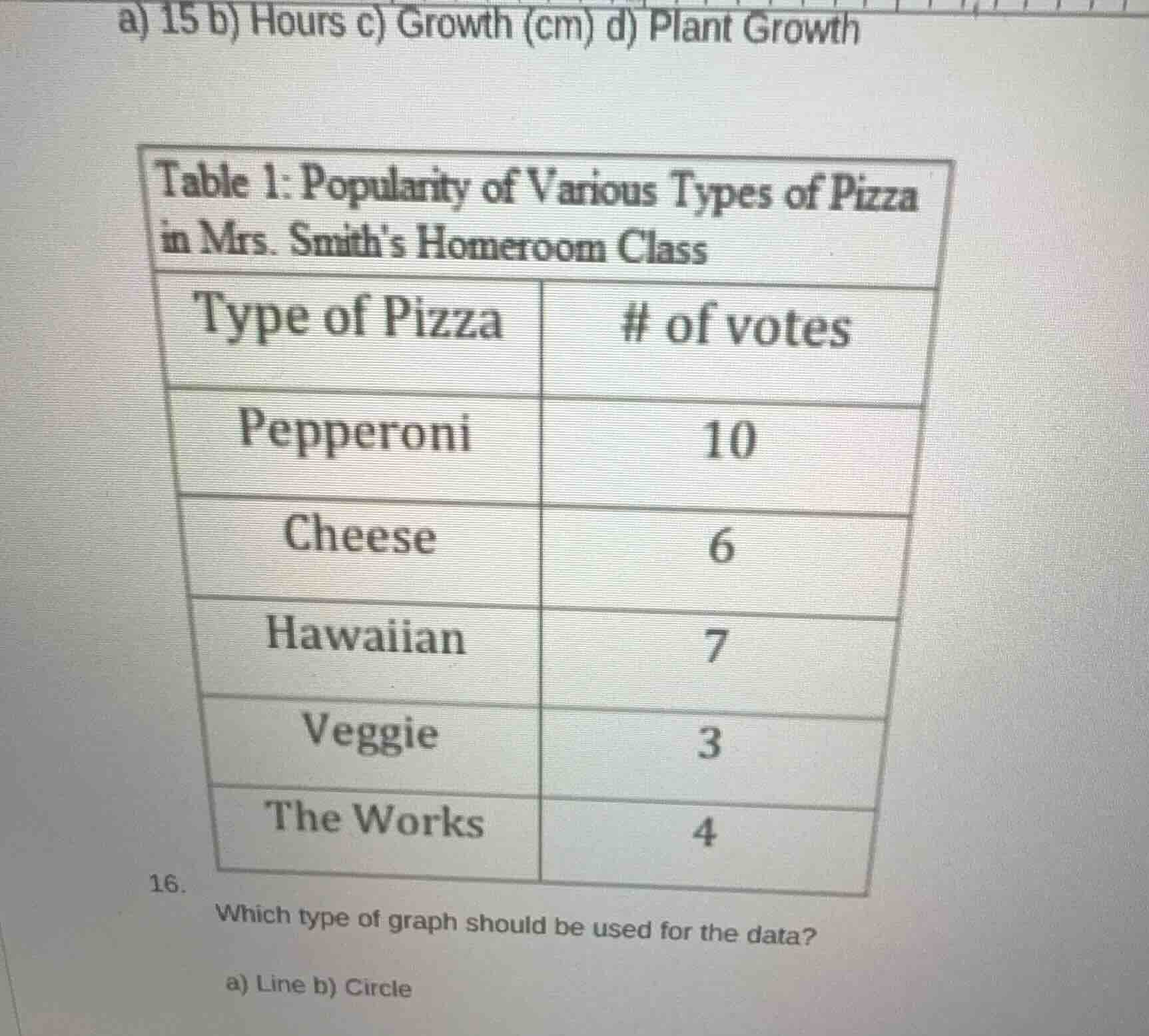
table 1: popularity of various types of pizza in mrs. smiths homeroom class
type of pizza | # of votes
pepperoni | 10
cheese | 6
hawaiian | 7
veggie | 3
the works | 4
- which type of graph should be used for the data?
a) line b) circle
The data shows categorical groups (pizza types) and their corresponding vote counts, which represent frequencies of each category. A bar graph is standard for comparing frequencies of distinct categories. However, among the given options, a circle (pie) graph can also display the proportion of votes each pizza type received relative to the total votes. Wait, correction: Wait, no—wait, the options given are a) Line, b) Circle. Line graphs track trends over continuous data (like time), which this is not. Circle (pie) graphs show parts of a whole, which fits since votes are parts of the total class votes. Wait, but actually, bar graphs are ideal, but since that's not an option, circle is the correct choice from the given ones. Wait, no, let's recheck: The data is categorical with counts, so circle graph can represent the percentage each pizza has of total votes, while line graph is for sequential data.

Snap & solve any problem in the app
Get step-by-step solutions on Sovi AI
Photo-based solutions with guided steps
Explore more problems and detailed explanations
b) Circle