QUESTION IMAGE
Question
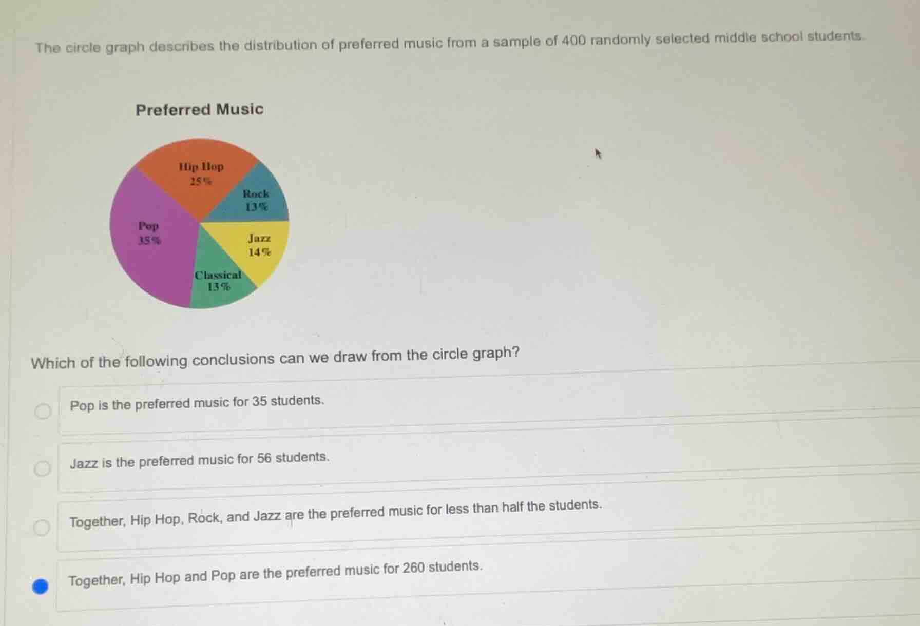
the circle graph describes the distribution of preferred music from a sample of 400 randomly selected middle school students.
preferred music
which of the following conclusions can we draw from the circle graph?
pop is the preferred music for 35 students.
jazz is the preferred music for 56 students.
together, hip hop, rock, and jazz are the preferred music for less than half the students.
together, hip hop and pop are the preferred music for 260 students.
Step1: Check Pop student count
Calculate $400 \times 35\% = 400 \times 0.35 = 140$
Step2: Check Jazz student count
Calculate $400 \times 14\% = 400 \times 0.14 = 56$
Step3: Check Hip Hop+Rock+Jazz total
Calculate $25\% + 13\% + 14\% = 52\%$, which is over 50%
Step4: Check Hip Hop+Pop student count
Calculate $400 \times (25\% + 35\%) = 400 \times 0.6 = 240$

Snap & solve any problem in the app
Get step-by-step solutions on Sovi AI
Photo-based solutions with guided steps
Explore more problems and detailed explanations
B. Jazz is the preferred music for 56 students.