QUESTION IMAGE
Question
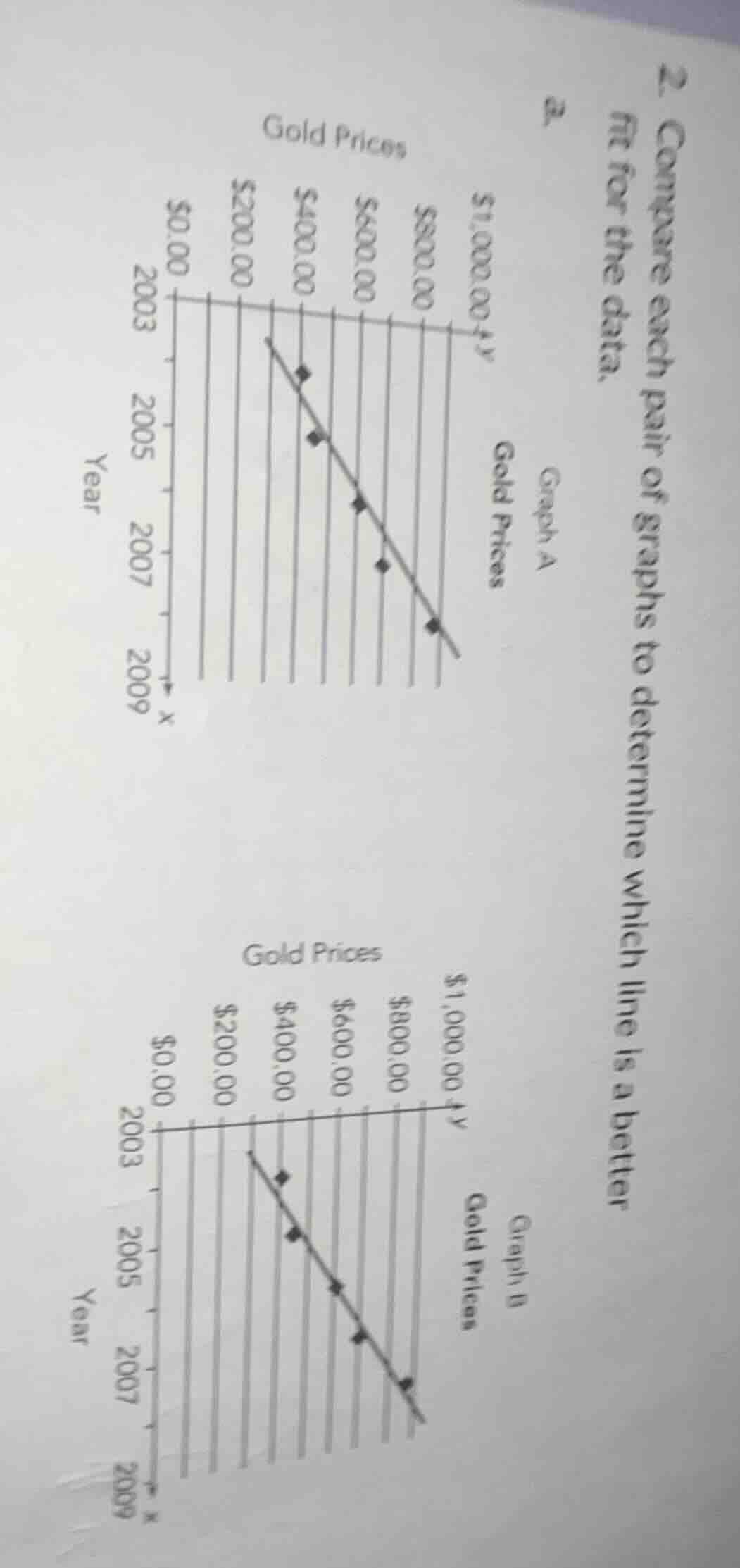
- compare each pair of graphs to determine which line is a better fit for the data.
a.
(graph a and graph b are about gold prices over years 2003 - 2009 with y - axis as gold prices from $0.00 to $1,000.00 and x - axis as year. graph a has a line and some data points, graph b has a line and some data points.)
Step1: Understand the concept of line of best fit
A better line of fit is one where the data points are closer to the line, meaning the deviations (vertical distances) from the points to the line are smaller overall.
Step2: Analyze Graph A and Graph B
- In Graph A, some data points are relatively far from the line, with noticeable gaps between the points and the line.
- In Graph B, the data points seem to lie more closely along the line, with smaller vertical distances from the points to the line. So Graph B's line is a better fit as the points are more tightly clustered around it.

Snap & solve any problem in the app
Get step-by-step solutions on Sovi AI
Photo-based solutions with guided steps
Explore more problems and detailed explanations
The line in Graph B is a better fit for the data.