QUESTION IMAGE
Question
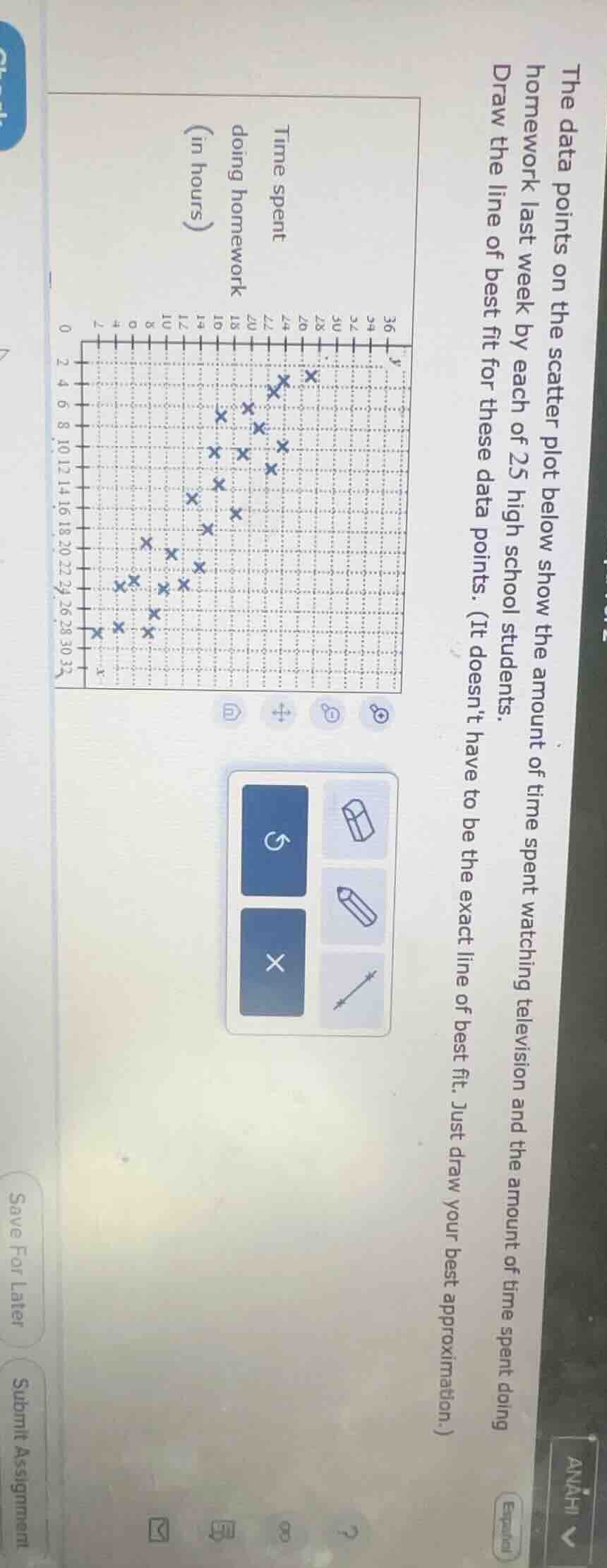
the data points on the scatter plot below show the amount of time spent watching television and the amount of time spent doing homework last week by each of 25 high school students. draw the line of best fit for these data points. (it doesnt have to be the exact line of best fit. just draw your best approximation.)
Step1: Identify Trend
The scatter plot shows a negative correlation (as x (TV time) increases, y (homework time) decreases). So the line of best fit should have a negative slope.
Step2: Approximate Middle
Find the middle of the data points. For example, take two points that seem to be near the center of the cluster. Let's say around (10, 24) and (30, 8).
Step3: Draw Line
Connect these approximate middle points (or a similar pair that represents the general trend) with a straight line, ensuring it passes through the "middle" of the scatter of points, balancing the number of points above and below the line as much as possible.
(Note: Since this is a drawing task, the key is to represent the negative linear trend. The actual line can be drawn by estimating the center of the data distribution and drawing a line with a negative slope that fits the overall pattern.)

Snap & solve any problem in the app
Get step-by-step solutions on Sovi AI
Photo-based solutions with guided steps
Explore more problems and detailed explanations
To draw the line of best fit:
- Observe the negative correlation (as TV time (x) increases, homework time (y) decreases).
- Identify the "middle" of the data cluster (e.g., find points near the center of the scatter).
- Draw a straight line with a negative slope that passes through this middle region, balancing points above and below the line.
(The line should approximate the overall trend of the data; exact coordinates are not required, just a reasonable approximation of the negative linear relationship.)