QUESTION IMAGE
Question
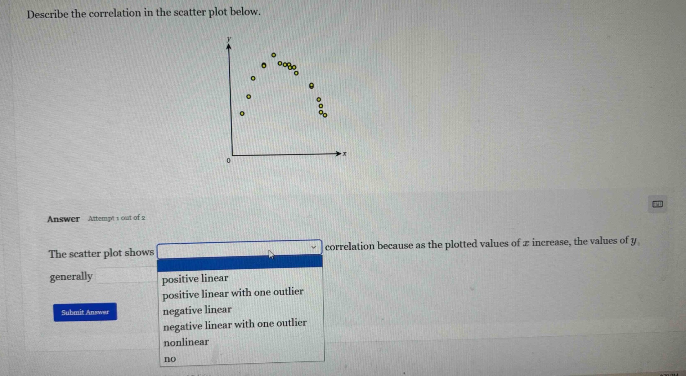
describe the correlation in the scatter plot below.
the scatter plot shows dropdown correlation because as the plotted values of ( x ) increase, the values of ( y ) generally blank
dropdown options: positive linear, positive linear with one outlier, negative linear, negative linear with one outlier, nonlinear, no
Brief Explanations
To determine the correlation, we analyze the scatter plot:
- Direction of Relationship: As \( x \) increases, \( y \) first increases to a peak and then decreases. This is not a linear (straight - line) relationship. A positive linear correlation would have \( y \) increasing steadily with \( x \), and a negative linear correlation would have \( y \) decreasing steadily with \( x \). Here, the pattern is curved, so it's nonlinear.
- Outlier Check: There's no single point that is far removed from the general pattern in a way that would indicate an outlier in the context of a linear relationship (since the relationship itself is nonlinear). Also, the pattern doesn't show a consistent linear increase or decrease. So the scatter plot shows a nonlinear correlation.

Snap & solve any problem in the app
Get step-by-step solutions on Sovi AI
Photo-based solutions with guided steps
Explore more problems and detailed explanations
The scatter plot shows \(\boldsymbol{\text{nonlinear}}\) correlation because as the plotted values of \( x \) increase, the values of \( y \) generally follow a curved (non - linear) pattern.