QUESTION IMAGE
Question
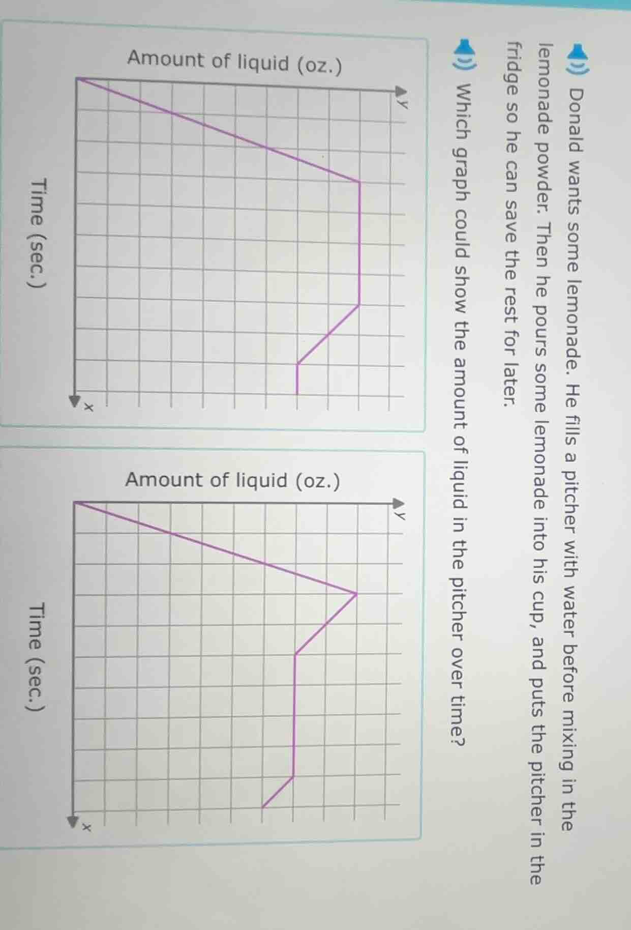
donald wants some lemonade. he fills a pitcher with water before mixing in the lemonade powder. then he pours some lemonade into his cup, and puts the pitcher in the fridge so he can save the rest for later. which graph could show the amount of liquid in the pitcher over time? two graphs are shown, each with time (sec.) on the x - axis and amount of liquid (oz.) on the y - axis, with a purple line representing the change in liquid amount over time.
Brief Explanations
- First, Donald fills the pitcher with water: the amount of liquid (y-axis) starts at 0 and increases to a maximum value over time (x-axis).
- Next, he adds lemonade powder: this does not change the amount of liquid, so the graph stays flat (horizontal line) during this step.
- Then, he pours some lemonade into his cup: the amount of liquid in the pitcher decreases to a lower constant value.
- Finally, he puts the pitcher in the fridge: the amount of liquid remains constant, so the graph stays flat again.
- Comparing the two graphs:
- The top graph: Starts high, decreases, then has flat segments and increases, which does not match the sequence.
- The bottom graph: Starts low, increases to a peak, stays flat, decreases, then stays flat, which matches the sequence of events perfectly.

Snap & solve any problem in the app
Get step-by-step solutions on Sovi AI
Photo-based solutions with guided steps
Explore more problems and detailed explanations
The bottom graph (the second graph labeled "Amount of liquid (oz.)" with Time (sec.) on the x-axis)