QUESTION IMAGE
Question
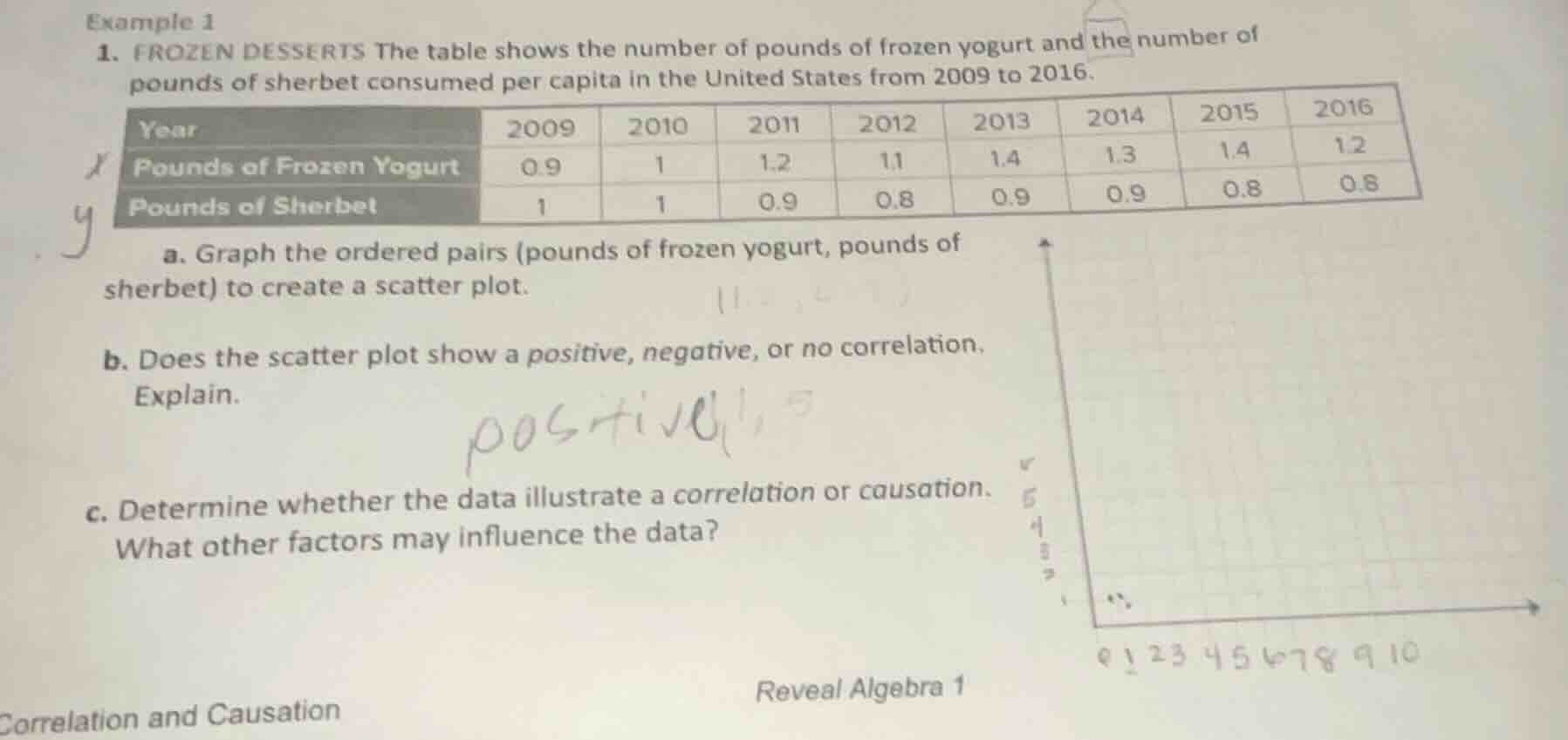
example 1
- frozen desserts the table shows the number of pounds of frozen yogurt and the number of pounds of sherbet consumed per capita in the united states from 2009 to 2016.
| year | 2009 | 2010 | 2011 | 2012 | 2013 | 2014 | 2015 | 2016 |
|---|---|---|---|---|---|---|---|---|
| pounds of sherbet | 1 | 1 | 0.9 | 0.8 | 0.9 | 0.9 | 0.8 | 0.8 |
a. graph the ordered pairs (pounds of frozen yogurt, pounds of sherbet) to create a scatter plot.
b. does the scatter plot show a positive, negative, or no correlation. explain.
c. determine whether the data illustrate a correlation or causation. what other factors may influence the data?
Part a:
First, identify all ordered pairs from the table: (0.9, 1), (1, 1), (1.2, 0.9), (1.1, 0.8), (1.4, 0.9), (1.3, 0.9), (1.4, 0.8), (1.2, 0.8). Plot each pair on a coordinate plane where the x-axis is "Pounds of Frozen Yogurt" and the y-axis is "Pounds of Sherbet".
Part b:
As the x-values (frozen yogurt) generally increase, the y-values (sherbet) tend to decrease. This pattern defines a negative correlation.
Part c:
Correlation means a relationship between two variables, while causation means one directly causes the other. Here, frozen yogurt consumption does not directly cause changes in sherbet consumption, so it is only correlation. Factors like consumer taste trends, price changes of the products, or availability of alternative frozen desserts could influence the data.

Snap & solve any problem in the app
Get step-by-step solutions on Sovi AI
Photo-based solutions with guided steps
Explore more problems and detailed explanations
a. Scatter plot with points: (0.9, 1), (1, 1), (1.2, 0.9), (1.1, 0.8), (1.4, 0.9), (1.3, 0.9), (1.4, 0.8), (1.2, 0.8) plotted on axes for frozen yogurt (x) and sherbet (y).
b. Negative correlation. As frozen yogurt consumption rises, sherbet consumption tends to fall.
c. The data show correlation, not causation. Factors like consumer preferences, product pricing, and competing frozen dessert options may influence the data.