QUESTION IMAGE
Question
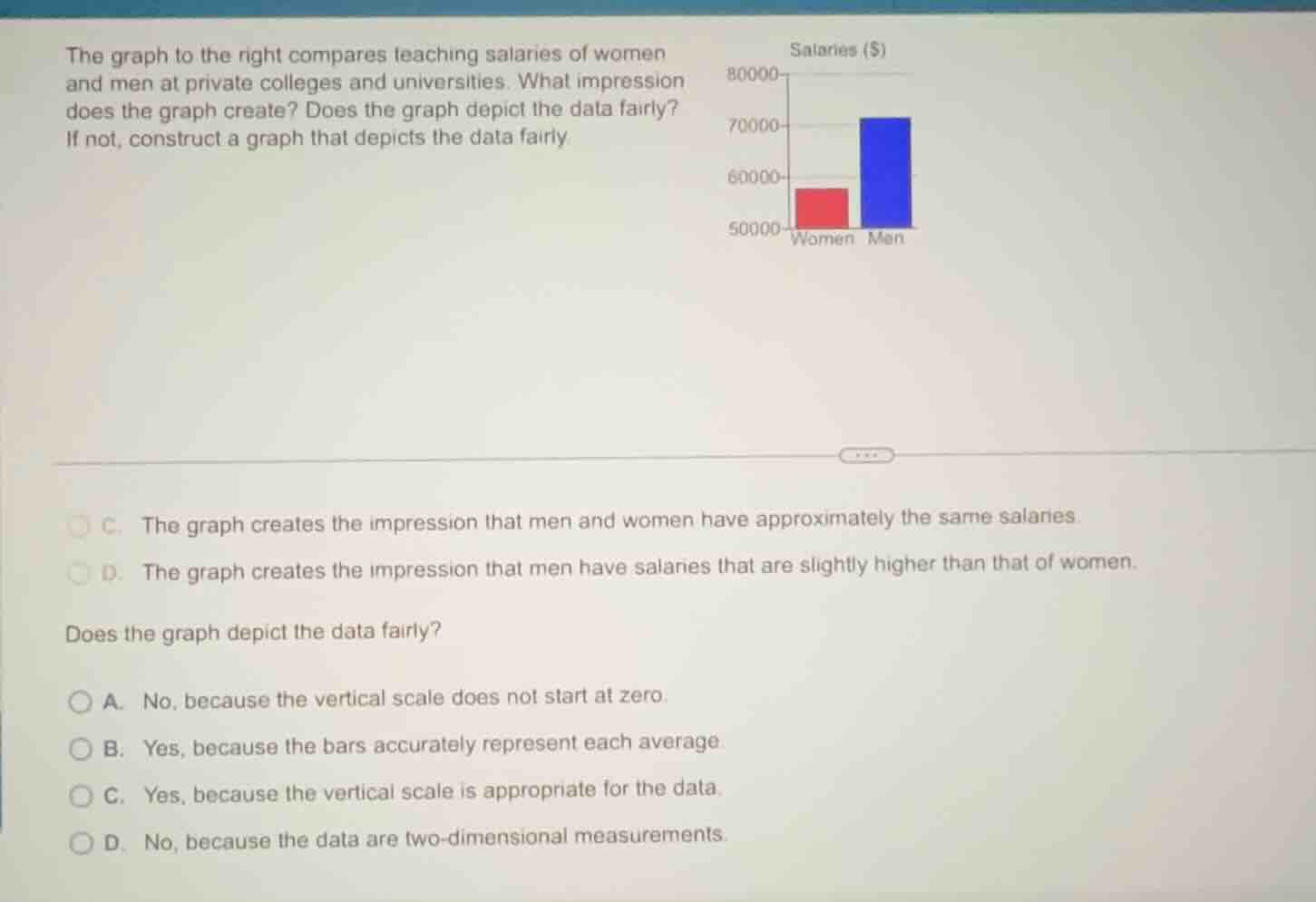
the graph to the right compares teaching salaries of women and men at private colleges and universities. what impression does the graph create? does the graph depict the data fairly? if not, construct a graph that depicts the data fairly c. the graph creates the impression that men and women have approximately the same salaries d. the graph creates the impression that men have salaries that are slightly higher than that of women. does the graph depict the data fairly? a. no, because the vertical scale does not start at zero. b. yes, because the bars accurately represent each average. c. yes, because the vertical scale is appropriate for the data. d. no, because the data are two - dimensional measurements.
First Part (Impression from the Graph)
To determine the impression, we analyze the bar heights. The men's bar (blue) is slightly taller than women's (red), suggesting a small salary difference. Option D states men's salaries are slightly higher, which matches the visual impression from the bar graph (even with the scale issue, the relative height gives this impression). Option C is incorrect as the bars aren't close enough to suggest "approximately the same."
A fair bar graph should have a vertical scale starting at zero (or be appropriately scaled to show proportional differences). Here, the vertical scale starts at 50000, not zero. This truncation can exaggerate the difference (or in this case, make a small difference look more noticeable than it is in proportion). Option A correctly identifies this issue. Option B is wrong because the scale start affects fairness. Option C is wrong as the scale isn't appropriate (starts at 50000, not zero). Option D is irrelevant as the data here is about salaries (one - dimensional in terms of the bar's height representing salary, not two - dimensional measurements).

Snap & solve any problem in the app
Get step-by-step solutions on Sovi AI
Photo-based solutions with guided steps
Explore more problems and detailed explanations
D. The graph creates the impression that men have salaries that are slightly higher than that of women.