QUESTION IMAGE
Question
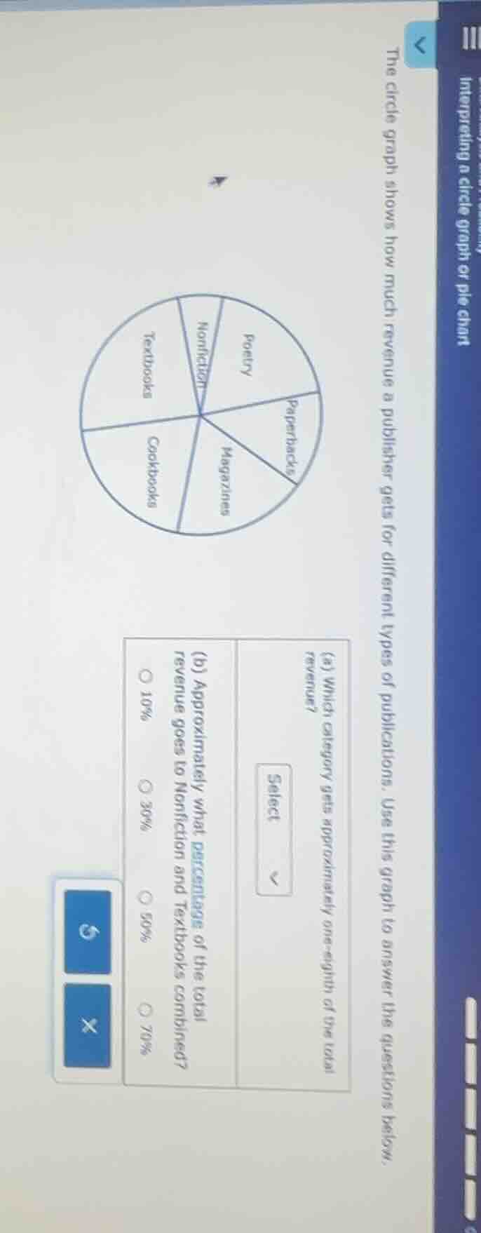
interpreting a circle graph or pie chart
the circle graph shows how much revenue a publisher gets for different types of publications. use this graph to answer the questions below.
(a) which category gets approximately one - eighth of the total revenue?
select
(b) approximately what percentage of the total revenue goes to nonfiction and textbooks combined?
10%
30%
50%
70%
Part (a)
A circle graph (pie chart) has a total of \(360^\circ\) or represents \(100\%\) of the data. One - eighth of the total is \(\frac{1}{8}\times100\% = 12.5\%\). We look at the sectors of the pie chart. The "Paperbacks" sector seems to be the smallest and closest to \(\frac{1}{8}\) (or \(12.5\%\)) of the total area of the pie chart.
Step 1: Analyze the sectors for Nonfiction and Textbooks
The Nonfiction sector and the Textbooks sector: Let's consider the size of each sector. The Nonfiction sector looks like it is about \(10\%\) and the Textbooks sector looks like it is about \(20\%\) (or we can also think in terms of the fraction of the circle). When we combine them, \(10\%+20\% = 30\%\) (or by visually estimating the combined area of the two sectors, it is approximately \(30\%\) of the total circle).

Snap & solve any problem in the app
Get step-by-step solutions on Sovi AI
Photo-based solutions with guided steps
Explore more problems and detailed explanations
Paperbacks