QUESTION IMAGE
Question
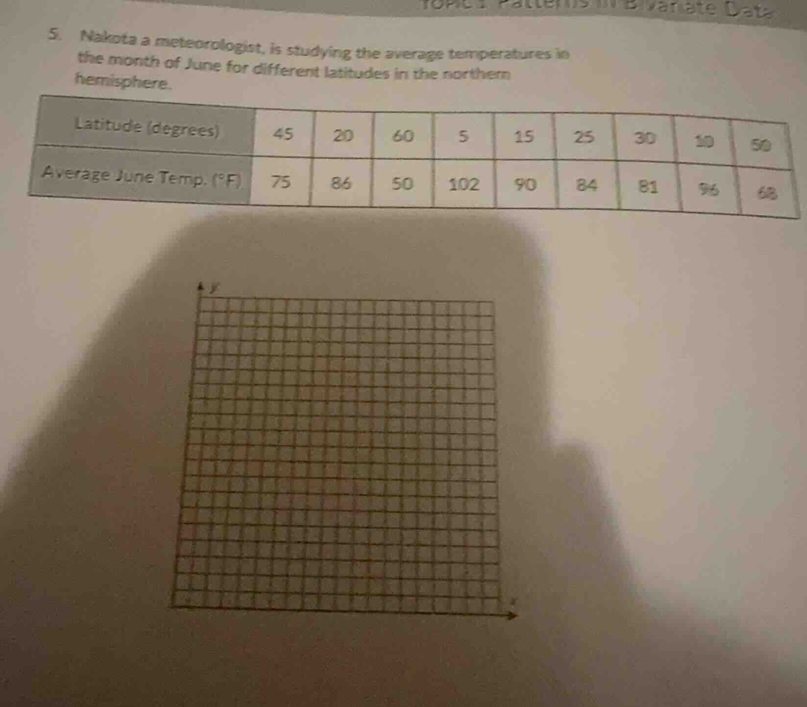
- nakota a meteorologist, is studying the average temperatures in the month of june for different latitudes in the northern hemisphere.
latitude (degrees) | 45 | 20 | 60 | 5 | 15 | 25 | 30 | 10 | 50
average june temp. (°f) | 75 | 86 | 50 | 102 | 90 | 84 | 81 | 96 | 68
To create a scatter plot for the given data (latitude vs. average June temperature), follow these steps:
Step 1: Identify the Variables
- Independent Variable (x - axis): Latitude (degrees). Values: 45, 20, 60, 5, 15, 25, 30, 10, 50.
- Dependent Variable (y - axis): Average June Temperature (°F). Values: 75, 86, 50, 102, 90, 84, 81, 96, 68.
Step 2: Set Up the Coordinate System
- x - axis (Latitude): Label it "Latitude (degrees)". Choose a scale that accommodates the range of latitude values (5 to 60 degrees). For example, use intervals of 5 or 10 degrees.
- y - axis (Temperature): Label it "Average June Temp (°F)". Choose a scale that accommodates the range of temperature values (50 to 102 °F). For example, use intervals of 5 or 10 °F.
Step 3: Plot the Data Points
For each pair of (latitude, temperature), plot a point on the coordinate system:
- (45, 75)
- (20, 86)
- (60, 50)
- (5, 102)
- (15, 90)
- (25, 84)
- (30, 81)
- (10, 96)
- (50, 68)
Step 4: Analyze the Pattern (Optional)
After plotting the points, observe the trend. In this case, as latitude increases (moving away from the equator), the average June temperature generally decreases. This shows a negative correlation between latitude and average June temperature in the northern hemisphere.
Final Scatter Plot Description
The scatter plot will have latitude on the x - axis and average June temperature on the y - axis. The points will show a downward - sloping trend, indicating that higher latitudes (farther from the equator) are associated with lower average June temperatures in the northern hemisphere.
(Note: Since we can't draw the actual plot here, the above steps describe how to create it. If you were to draw it on the provided grid, you would mark each of the data points according to the x and y values as described.)

Snap & solve any problem in the app
Get step-by-step solutions on Sovi AI
Photo-based solutions with guided steps
Explore more problems and detailed explanations
To create a scatter plot for the given data (latitude vs. average June temperature), follow these steps:
Step 1: Identify the Variables
- Independent Variable (x - axis): Latitude (degrees). Values: 45, 20, 60, 5, 15, 25, 30, 10, 50.
- Dependent Variable (y - axis): Average June Temperature (°F). Values: 75, 86, 50, 102, 90, 84, 81, 96, 68.
Step 2: Set Up the Coordinate System
- x - axis (Latitude): Label it "Latitude (degrees)". Choose a scale that accommodates the range of latitude values (5 to 60 degrees). For example, use intervals of 5 or 10 degrees.
- y - axis (Temperature): Label it "Average June Temp (°F)". Choose a scale that accommodates the range of temperature values (50 to 102 °F). For example, use intervals of 5 or 10 °F.
Step 3: Plot the Data Points
For each pair of (latitude, temperature), plot a point on the coordinate system:
- (45, 75)
- (20, 86)
- (60, 50)
- (5, 102)
- (15, 90)
- (25, 84)
- (30, 81)
- (10, 96)
- (50, 68)
Step 4: Analyze the Pattern (Optional)
After plotting the points, observe the trend. In this case, as latitude increases (moving away from the equator), the average June temperature generally decreases. This shows a negative correlation between latitude and average June temperature in the northern hemisphere.
Final Scatter Plot Description
The scatter plot will have latitude on the x - axis and average June temperature on the y - axis. The points will show a downward - sloping trend, indicating that higher latitudes (farther from the equator) are associated with lower average June temperatures in the northern hemisphere.
(Note: Since we can't draw the actual plot here, the above steps describe how to create it. If you were to draw it on the provided grid, you would mark each of the data points according to the x and y values as described.)