QUESTION IMAGE
Question
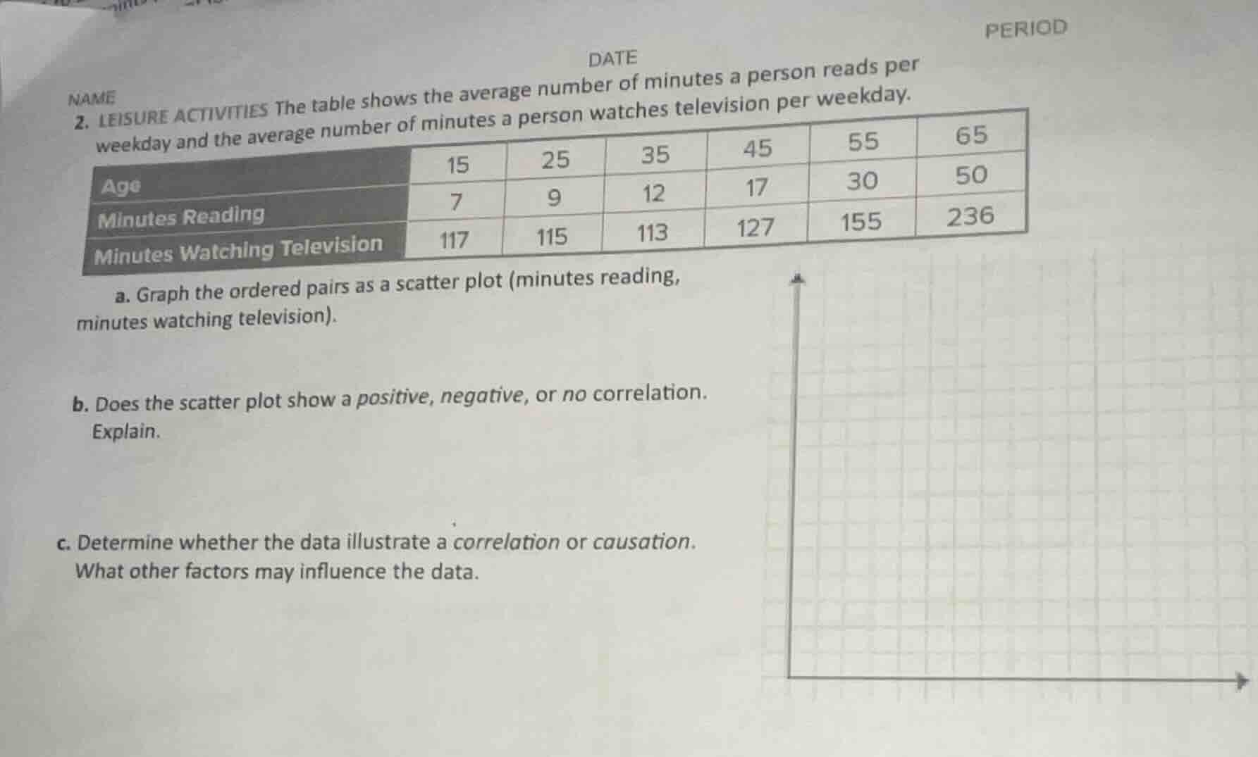
name
date
period
- leisure activities the table shows the average number of minutes a person reads per weekday and the average number of minutes a person watches television per weekday.
| age | 15 | 25 | 35 | 45 | 55 | 65 |
|---|---|---|---|---|---|---|
| minutes watching television | 117 | 115 | 113 | 127 | 155 | 236 |
a. graph the ordered pairs as a scatter plot (minutes reading, minutes watching television).
b. does the scatter plot show a positive, negative, or no correlation. explain.
c. determine whether the data illustrate a correlation or causation. what other factors may influence the data.
Step1: Identify ordered pairs
Ordered pairs: $(7,117), (9,115), (12,113), (17,127), (30,155), (50,236)$
Step2: Plot points on scatter plot
- Label x-axis: "Minutes Reading" (scale 0-55)
- Label y-axis: "Minutes Watching Television" (scale 0-240)
- Plot each ordered pair on the grid.
b. As the minutes spent reading increase, the minutes spent watching television also increases. This upward trend indicates a positive correlation.
c. The data shows correlation, not causation. Reading more does not directly cause someone to watch more television. Age is a key influencing factor: older individuals in the dataset both read more and watch more television, so age drives both variables. Other factors could include free time availability, work/school schedule, or personal leisure preferences.

Snap & solve any problem in the app
Get step-by-step solutions on Sovi AI
Photo-based solutions with guided steps
Explore more problems and detailed explanations
a. (Scatter plot with x-axis "Minutes Reading", y-axis "Minutes Watching Television", and points plotted at $(7,117), (9,115), (12,113), (17,127), (30,155), (50,236)$)
b. Positive correlation
c. The data shows correlation (not causation). Age, free time, and personal preferences are influencing factors.