QUESTION IMAGE
Question
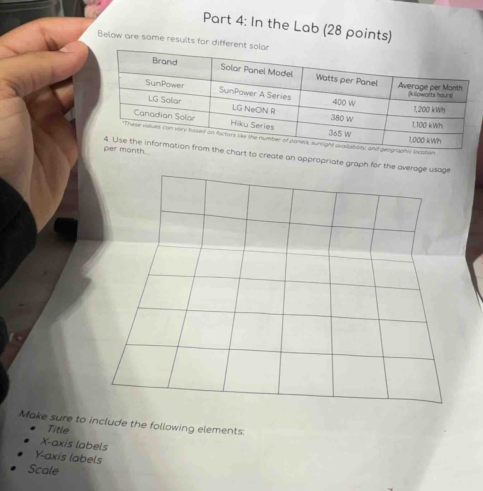
part 4: in the lab (28 points)
below are some results for different solar
| brand | solar panel model | watts per panel | average per month (kilowatts hours) |
|---|---|---|---|
| lg solar | lg neon r | 380 w | 1,100 kwh |
| canadian solar | hiku series | 365 w | 1,000 kwh |
*these values can vary based on factors like the number of panels, sunlight availability, and geographic location
- use the information from the chart to create an appropriate graph for the average usage per month..
make sure to include the following elements:
- title
- x - axis labels
- y - axis labels
- scale
To create the graph (a bar graph is appropriate here) for the average monthly usage of different solar panel brands:
Step 1: Determine the Type of Graph
A bar graph is suitable to compare the average monthly kilowatt - hours (kWh) of different solar panel brands.
Step 2: Set Up the Axes and Title
- Title: "Average Monthly kWh Usage of Different Solar Panel Brands"
- X - axis Labels: The brands: SunPower, LG Solar, Canadian Solar.
- Y - axis Labels: "Average per Month (Kilowatt - hours)"
- Scale for Y - axis: The values of average monthly usage are 1000 kWh, 1100 kWh, and 1200 kWh. We can set the scale with intervals of 100 kWh, ranging from 900 kWh to 1300 kWh to clearly show the differences.
Step 3: Plot the Data
- For SunPower, the average per month is 1200 kWh. So, we draw a bar above "SunPower" on the X - axis that reaches up to the 1200 kWh mark on the Y - axis.
- For LG Solar, the average per month is 1100 kWh. Draw a bar above "LG Solar" that reaches the 1100 kWh mark.
- For Canadian Solar, the average per month is 1000 kWh. Draw a bar above "Canadian Solar" that reaches the 1000 kWh mark.
If we were to represent this in a table - like summary of the graph components:
| Graph Component | Details |
|---|---|
| X - axis Labels | SunPower, LG Solar, Canadian Solar |
| Y - axis Labels | Average per Month (Kilowatt - hours) |
| Y - axis Scale | 900, 1000, 1100, 1200, 1300 (intervals of 100) |
| Data Points (Bar Heights) | SunPower: 1200, LG Solar: 1100, Canadian Solar: 1000 |
The final graph (in a textual description of the bar graph) will have three bars, one for each brand, with heights corresponding to their average monthly kWh usage, along with the appropriate title, axis labels, and scale.

Snap & solve any problem in the app
Get step-by-step solutions on Sovi AI
Photo-based solutions with guided steps
Explore more problems and detailed explanations
A bar graph with title "Average Monthly kWh Usage of Different Solar Panel Brands", X - axis labels (SunPower, LG Solar, Canadian Solar), Y - axis label "Average per Month (Kilowatt - hours)", Y - axis scale (900 - 1300 kWh with 100 kWh intervals), and bars of heights 1200, 1100, 1000 kWh for SunPower, LG Solar, Canadian Solar respectively.