QUESTION IMAGE
Question
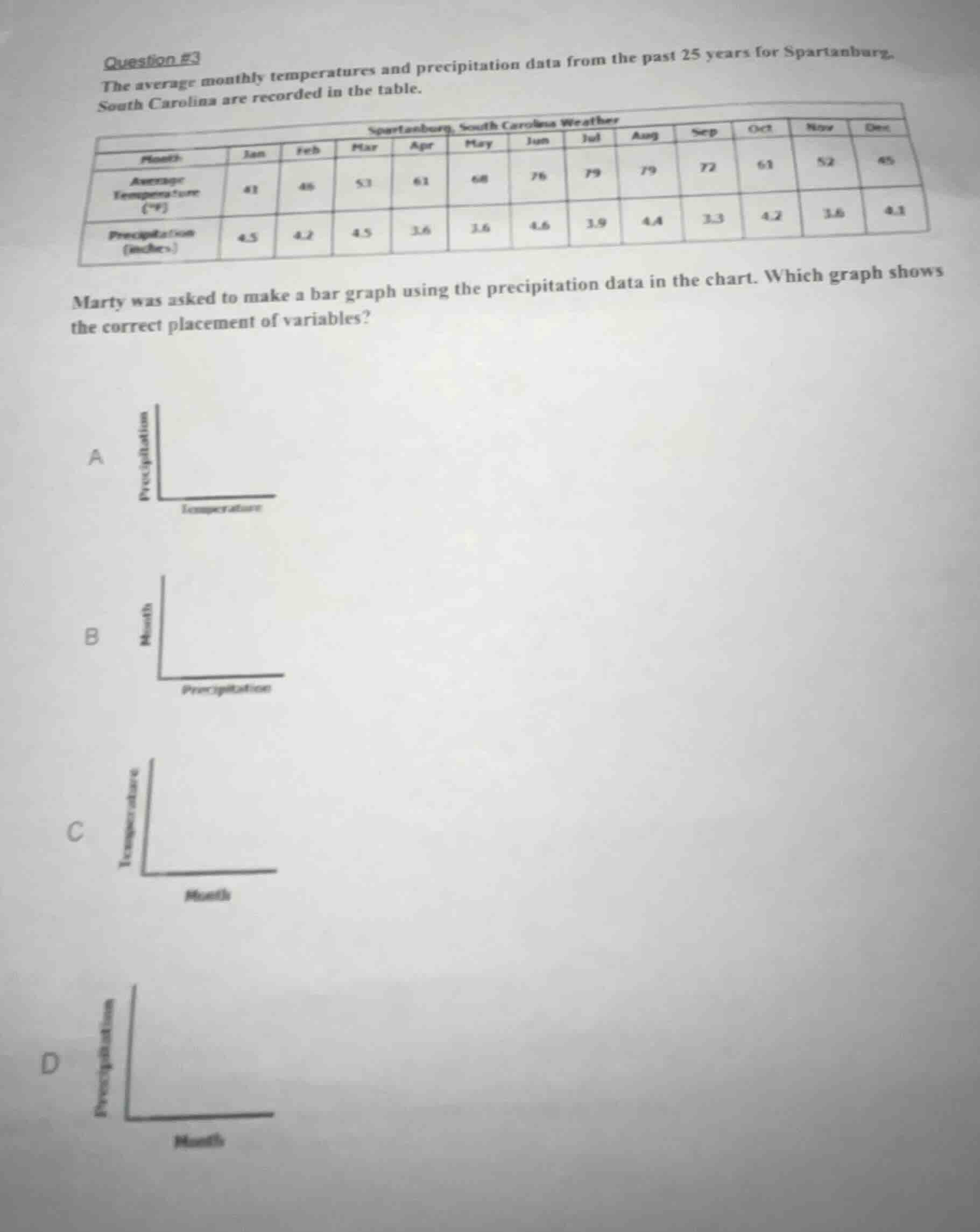
question #3
the average monthly temperatures and precipitation data from the past 25 years for spartanburg, south carolina are recorded in the table.
spartanburg, south carolina weather
| month | jan | feb | mar | apr | may | jun | jul | aug | sep | oct | nov | dec |
|---|---|---|---|---|---|---|---|---|---|---|---|---|
| precipitation (inches) | 4.5 | 4.2 | 4.5 | 3.6 | 3.6 | 4.6 | 3.9 | 4.4 | 3.3 | 4.2 | 3.6 | 4.1 |
marty was asked to make a bar graph using the precipitation data in the chart. which graph shows the correct placement of variables?
a
graph a: precipitation on y - axis, temperature on x - axis
b
graph b: month on y - axis, precipitation on x - axis
c
graph c: temperature on y - axis, month on x - axis
d
graph d: precipitation on y - axis, month on x - axis
To create a bar graph for precipitation data, the independent variable (months, a categorical variable) should be on the horizontal (x) axis, and the dependent variable (precipitation, the measured value) should be on the vertical (y) axis. We eliminate options that use unrelated variables (temperature) or swap the axis placement incorrectly.

Snap & solve any problem in the app
Get step-by-step solutions on Sovi AI
Photo-based solutions with guided steps
Explore more problems and detailed explanations
D. (Graph with Precipitation on the vertical axis and Months on the horizontal axis)