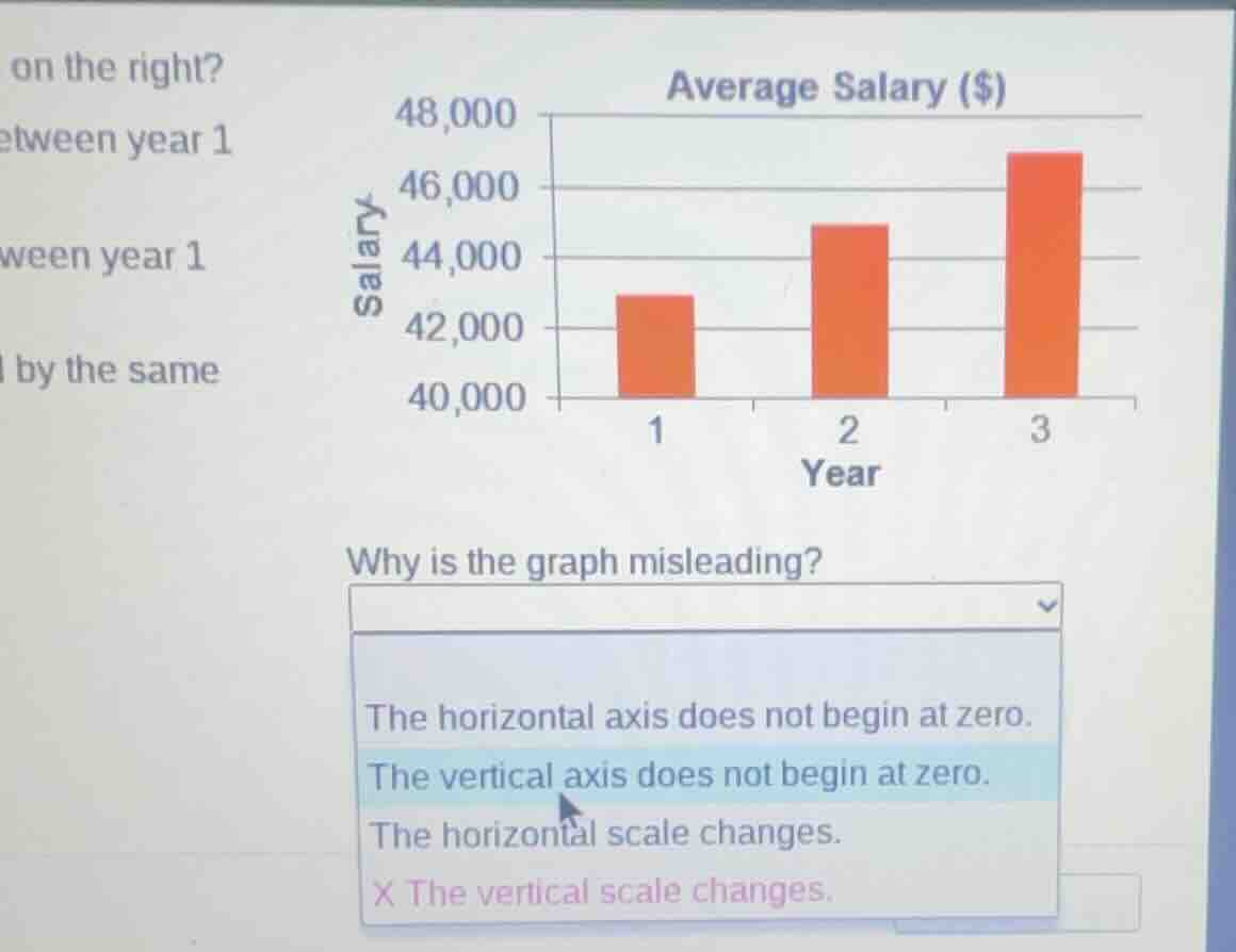
QUESTION IMAGE
Question
on the right?
etween year 1
ween year 1
l by the same
average salary ($)
why is the graph misleading?
the horizontal axis does not begin at zero.
the vertical axis does not begin at zero.
the horizontal scale changes.
x the vertical scale changes.
Brief Explanations
A bar graph that has a vertical axis not starting at zero exaggerates the visual difference between the values. In this graph, the vertical axis starts at 40,000 instead of 0, making the increase in salaries appear larger than it actually is, which misleads the viewer about the magnitude of change.

Snap & solve any problem in the app
Get step-by-step solutions on Sovi AI
Photo-based solutions with guided steps
Explore more problems and detailed explanations
The vertical axis does not begin at zero.