QUESTION IMAGE
Question
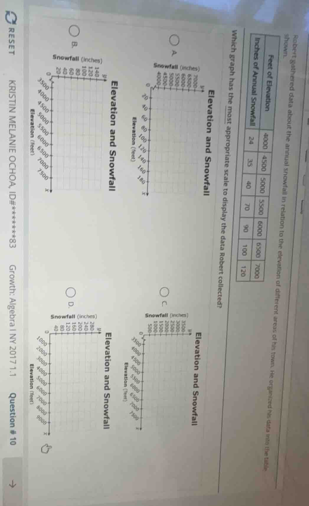
robert gathered data about the annual snowfall in relation to the elevation of different areas of his town. he organized his data into the table shown. feet of elevation | inches of annual snowfall 4000 | 24 4500 | 35 5000 | 40 5500 | 70 6000 | 90 6500 | 100 7000 | 120 which graph has the most appropriate scale to display the data robert collected? four graphs labeled a, b, c, d showing elevation and snowfall with different scales are included (omitted here as per ocr text processing rule)
Step1: Identify data ranges
Elevation: 4000–7000 feet; Snowfall: 24–120 inches.
Step2: Check x-axis (Elevation)
Graphs A, B, C have x-axis 3500–7500 (matches data range). Graph D's x-axis 0–9000 is too broad.
Step3: Check y-axis (Snowfall)
Graph B has y-axis 0–140 (matches 24–120). Graph A's y-axis 0–180 is too large; Graph C's y-axis 0–3500 is incorrect scale.
Step4: Verify axis alignment
Graph B uses correct units and scales for both variables, fitting all data points without wasted space.

Snap & solve any problem in the app
Get step-by-step solutions on Sovi AI
Photo-based solutions with guided steps
Explore more problems and detailed explanations
B. Elevation and Snowfall (with x-axis 3500-7500 feet, y-axis 0-140 inches)