QUESTION IMAGE
Question
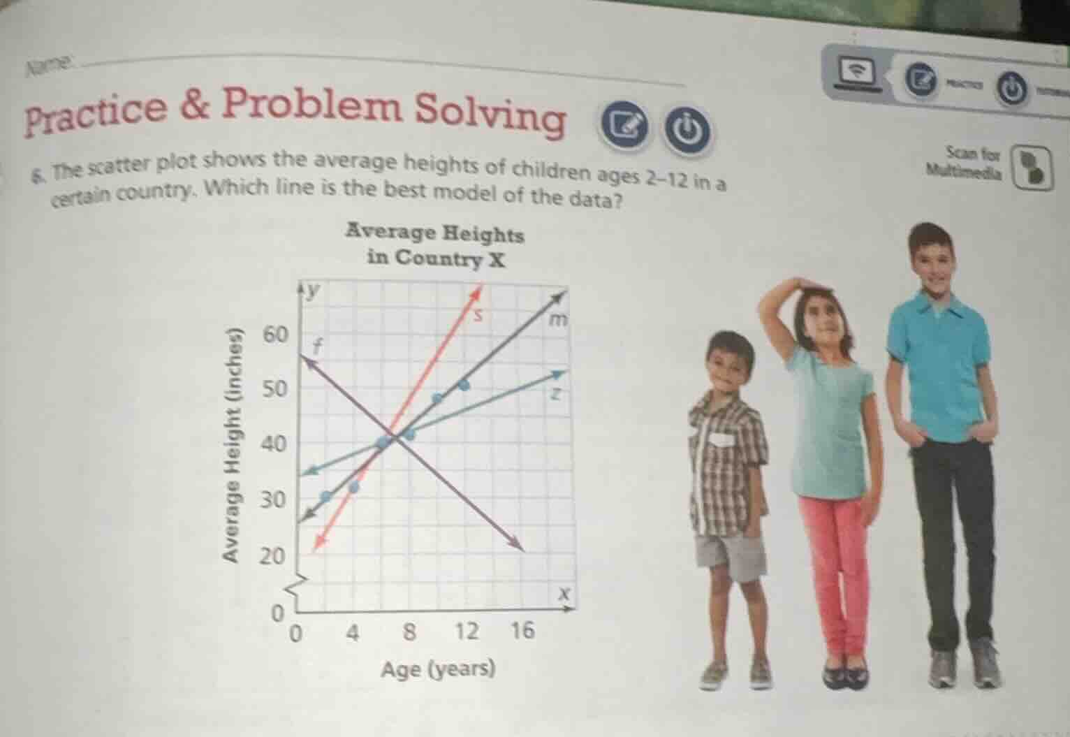
- the scatter plot shows the average heights of children ages 2–12 in a certain country. which line is the best model of the data?
Step1: Analyze the trend of the data
The scatter plot shows the average height of children with age (2 - 12 years). As age increases, the average height should increase (positive correlation). So we can eliminate the line with negative slope (line \( f \)).
Step2: Analyze the steepness of the lines
Now we have lines \( s \), \( m \), \( z \). The data points (heights of children) should have a reasonable growth rate. Line \( s \) is too steep (implies very fast growth in height with age, which is not realistic for children's height growth). Line \( z \) is too flat (implies very slow growth, which is also not realistic). Line \( m \) has a slope that seems to fit the general trend of children's height increasing with age at a reasonable rate, and it should pass through or be close to most of the data points.

Snap & solve any problem in the app
Get step-by-step solutions on Sovi AI
Photo-based solutions with guided steps
Explore more problems and detailed explanations
Line \( m \)