QUESTION IMAGE
Question
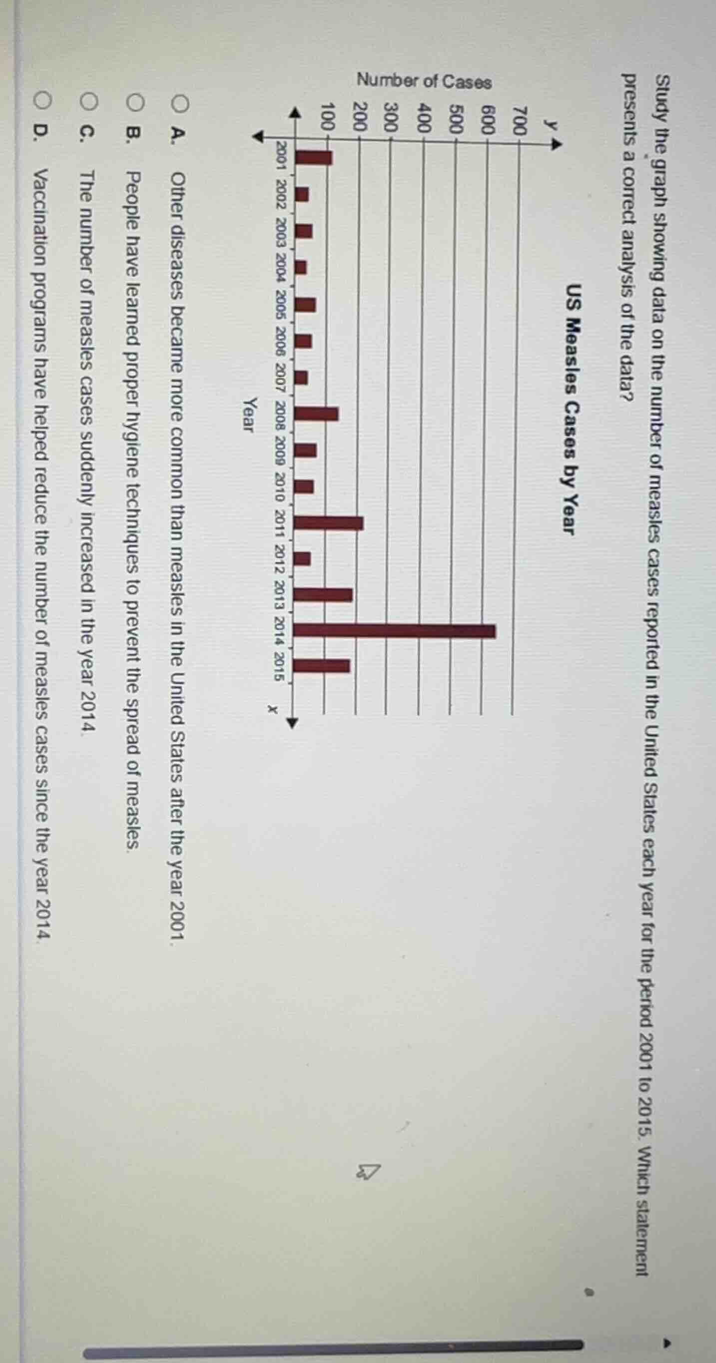
study the graph showing data on the number of measles cases reported in the united states each year for the period 2001 to 2015. which statement presents a correct analysis of the data? us measles cases by year a. other diseases became more common than measles in the united states after the year 2001. b. people have learned proper hygiene techniques to prevent the spread of measles. c. the number of measles cases suddenly increased in the year 2014. d. vaccination programs have helped reduce the number of measles cases since the year 2014.
- Option A: The graph only shows measles data, no info on other diseases, so this is incorrect.
- Option B: The graph does not provide data on hygiene practices, so this is unsupported.
- Option C: The bar for 2014 is the tallest, showing a sharp increase in measles cases that year, which matches the graph.
- Option D: 2015 has fewer cases than 2014, but the graph does not attribute this to vaccination programs, and this claim is not supported by the given data.

Snap & solve any problem in the app
Get step-by-step solutions on Sovi AI
Photo-based solutions with guided steps
Explore more problems and detailed explanations
C. The number of measles cases suddenly increased in the year 2014.