QUESTION IMAGE
Question
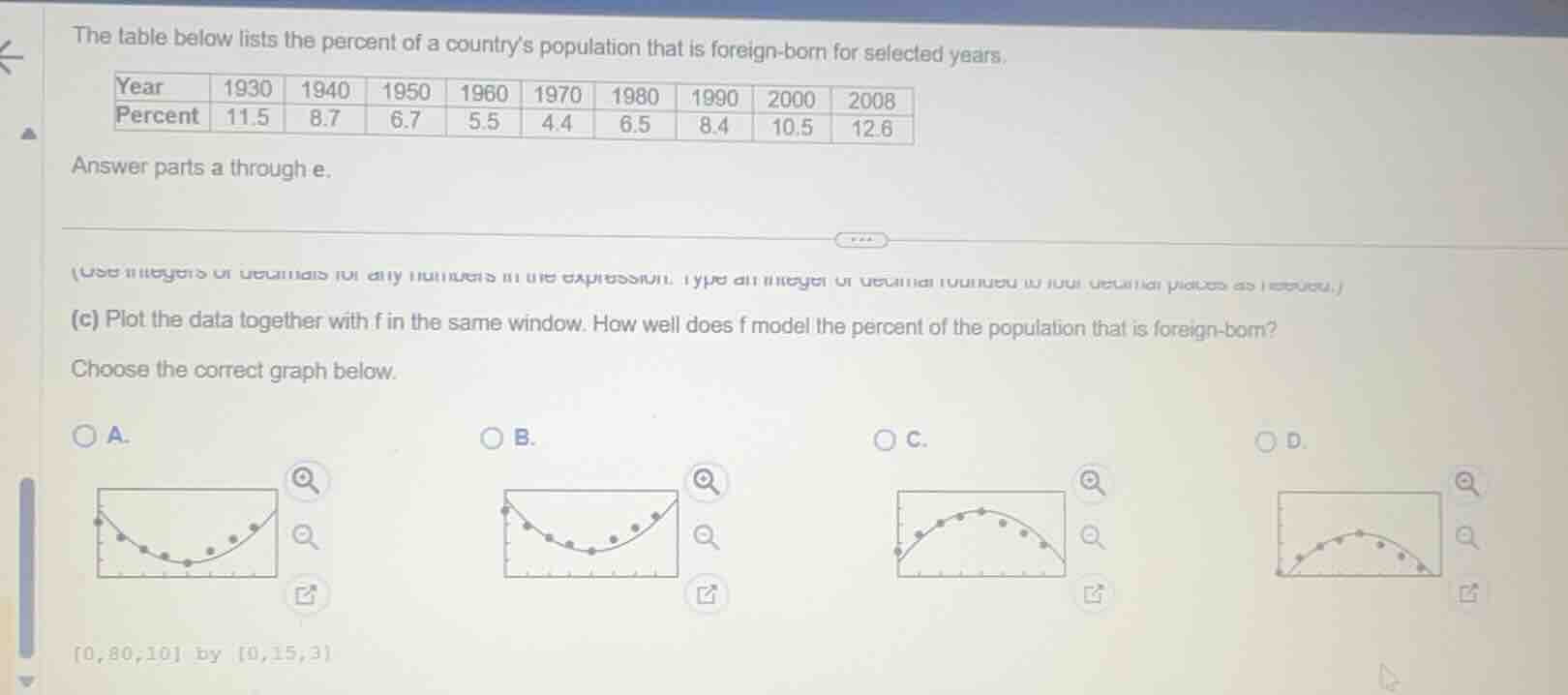
the table below lists the percent of a countrys population that is foreign-born for selected years.
| year | 1930 | 1940 | 1950 | 1960 | 1970 | 1980 | 1990 | 2000 | 2008 |
|---|
answer parts a through e.
(c) plot the data together with f in the same window. how well does f model the percent of the population that is foreign-born?
choose the correct graph below.
a.
b.
c.
d.
0,80,10 by 0,15,3
First, analyze the trend of the data: the percent of foreign-born population decreases from 1930 (11.5) to 1970 (4.4), then increases through 2008 (12.6), forming a U-shaped curve. Now match this to the graphs:
- Graphs C and D are downward-opening curves (peak then decline), which do not match the data trend.
- Graph A: the data points do not align with the U-shape's upward phase correctly.
- Graph B: the data points follow the U-shaped trend (fall to a minimum then rise) that matches the given year-percent data.

Snap & solve any problem in the app
Get step-by-step solutions on Sovi AI
Photo-based solutions with guided steps
Explore more problems and detailed explanations
B. <The graph with a U-shaped curve where data points fall to a minimum then rise, matching the trend of decreasing then increasing foreign-born population percent>