QUESTION IMAGE
Question
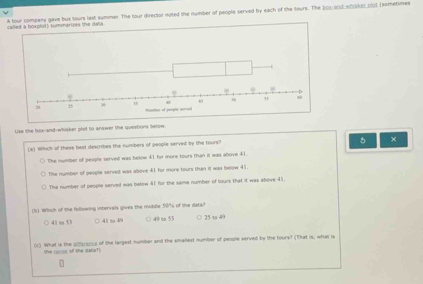
a tour company gave bus tours last summer. the tour director noted the number of people served by each of the tours. the box-and-whisker plot (sometimes called a boxplot) summarizes the data. box-and-whisker plot image use the box-and-whisker plot to answer the questions below. (a) which of these best describes the numbers of people served by the tours? - the number of people served was below 41 for more tours than it was above 41. - the number of people served was above 41 for more tours than it was below 41. - the number of people served was below 41 for the same number of tours that it was above 41. (b) which of the following intervals gives the middle 50% of the data? - 41 to 53 - 41 to 49 - 49 to 53 - 25 to 49 (c) what is the difference of the largest number and the smallest number of people served by the tours? (that is, what is the range of the data?)
Step1: Analyze median for (a)
The median (middle line of box) is 49, not 41. 50% of data is above 49, so more data is above 41 than below.
Step2: Identify IQR for (b)
Middle 50% = IQR, from Q1 (41) to Q3 (53).
Step3: Calculate range for (c)
Range = Max - Min = $57 - 22$

Snap & solve any problem in the app
Get step-by-step solutions on Sovi AI
Photo-based solutions with guided steps
Explore more problems and detailed explanations
(a) The number of people served was above 41 for more tours than it was below 41.
(b) 41 to 53
(c) 35