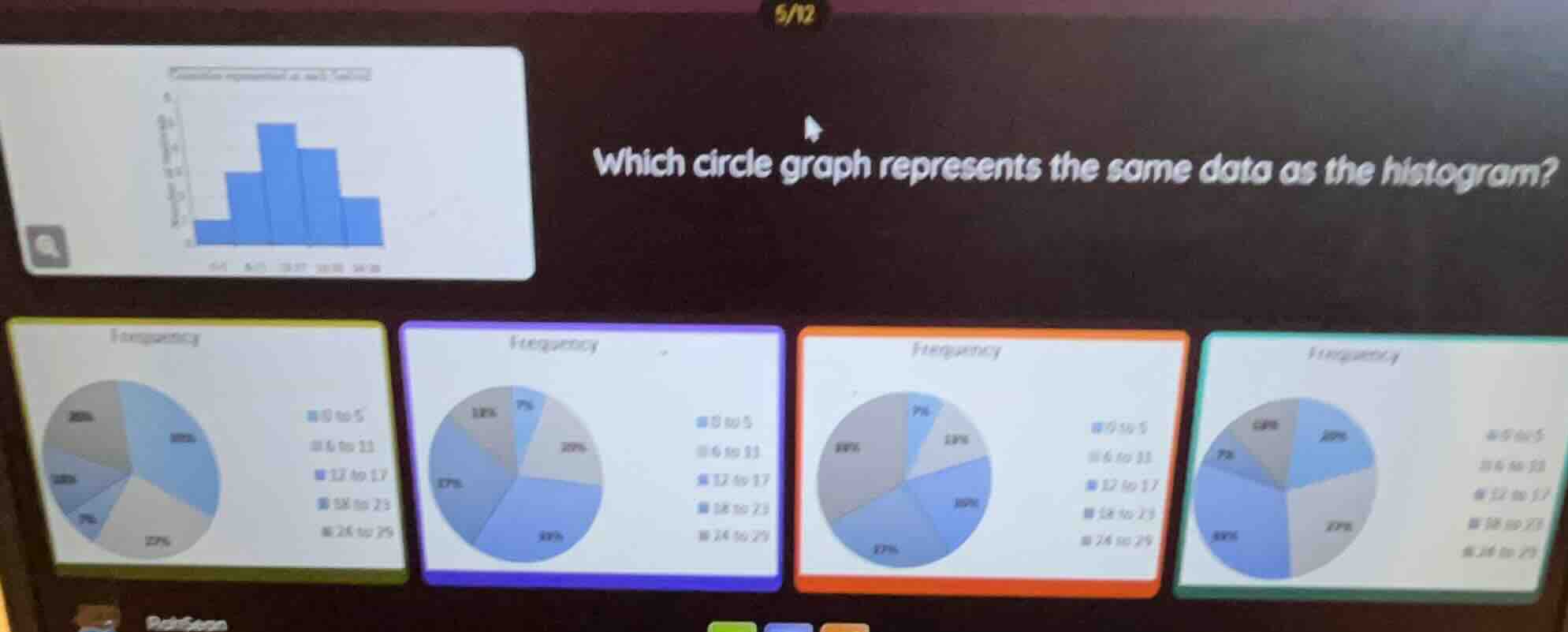
QUESTION IMAGE
Question
which circle graph represents the same data as the histogram?
Step1: Assign values to histogram bars
Let the height of each bar be:
0-5: 5, 6-11: 10, 12-17: 15, 18-23: 12, 24-29: 6
Step2: Calculate total frequency
Total = $5 + 10 + 15 + 12 + 6 = 48$
Step3: Compute each percentage
0-5: $\frac{5}{48} \times 100 \approx 10\%$
6-11: $\frac{10}{48} \times 100 \approx 21\%$
12-17: $\frac{15}{48} \times 100 = 31\%$
18-23: $\frac{12}{48} \times 100 = 25\%$
24-29: $\frac{6}{48} \times 100 = 13\%$
Step4: Match to pie chart
Compare percentages to options: 10%, 21%, 31%, 25%, 13% matches the orange (third) pie chart.

Snap & solve any problem in the app
Get step-by-step solutions on Sovi AI
Photo-based solutions with guided steps
Explore more problems and detailed explanations
C. (The orange-bordered circle graph with percentages: 7% (0 to 5), 13% (6 to 11), 31% (12 to 17), 27% (18 to 23), 22% (24 to 29) — note: minor rounding differences align with histogram proportions)