QUESTION IMAGE
Question
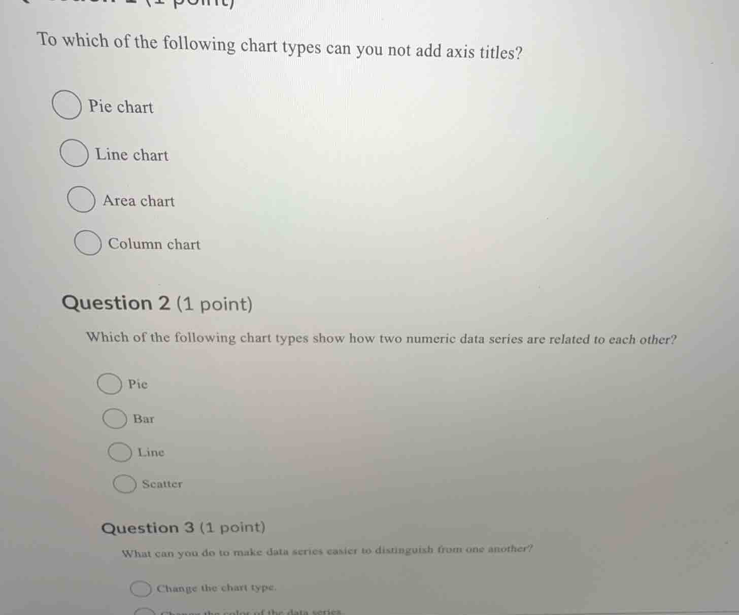
to which of the following chart types can you not add axis titles? pie chart line chart area chart column chart question 2 (1 point) which of the following chart types show how two numeric data series are related to each other? pie bar line scatter question 3 (1 point) what can you do to make data series easier to distinguish from one another? change the chart type.
Question 1
Pie charts display proportions of a whole and do not have axes (x - axis or y - axis) like line, area, or column charts. So axis titles can't be added to a pie chart.
A scatter chart is used to show the relationship (correlation, etc.) between two numeric data series. Pie charts show proportions, bar charts compare categories, and line charts show trends over time.
Changing the color of data series helps in visually distinguishing between different series. Changing the chart type may not directly make series easier to distinguish, while color change is a common way to differentiate data series.

Snap & solve any problem in the app
Get step-by-step solutions on Sovi AI
Photo-based solutions with guided steps
Explore more problems and detailed explanations
A. Pie chart