QUESTION IMAGE
Question
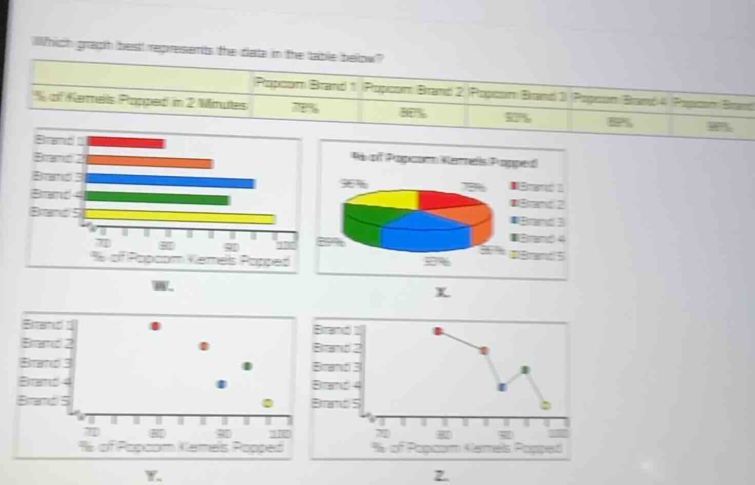
which graph best represents the data in the table below?
% of kernels popped in 2 minutes | popcorn brand 1 | popcorn brand 2 | popcorn brand 3 | popcorn brand 4 | popcorn brand 5
| 78% | 86% | 92% | 89% | 96% |
bar graph (w), pie chart (x), scatter plot (y), line graph (z) with respective brand and percentage visualizations
Step1: Analyze the data type
The data is about the percentage of kernels popped for different popcorn brands, which is a categorical (brands) vs. numerical (percentage) relationship. A bar graph is suitable for comparing categories, a pie chart for parts of a whole (not here as we are comparing brands, not parts of a single whole), scatter plot for two numerical variables (not here), and line graph for trends over time (not here).
Step2: Evaluate Graph W
Graph W is a bar graph. Let's check the values:
- Brand 1: 78% – the red bar should end near 78.
- Brand 2: 86% – orange bar near 86.
- Brand 3: 92% – blue bar near 92.
- Brand 4: 89% – green bar near 89.
- Brand 5: 96% – yellow bar near 96.
These match the table values.
Step3: Evaluate Graph X (Pie Chart)
Pie charts show proportions of a whole. Here, we are comparing different brands, not parts of a single whole (e.g., total kernels across brands). Also, the percentages in the pie chart (75%, 86%, 92%, 89%, 96%) don't sum to 100% (75+86+92+89+96 = 438%), so it's incorrect.
Step4: Evaluate Graph Y (Scatter Plot)
Scatter plots are for two numerical variables (e.g., x and y). Here, we have one numerical (percentage) and one categorical (brand), so scatter plot is inappropriate.
Step5: Evaluate Graph Z (Line Graph)
Line graphs are for showing trends over time or continuous data. Here, brands are categorical, not a continuous variable, so line graph is inappropriate.

Snap & solve any problem in the app
Get step-by-step solutions on Sovi AI
Photo-based solutions with guided steps
Explore more problems and detailed explanations
Graph W (the bar graph labeled W) best represents the data as it correctly uses a bar graph to compare the percentage of kernels popped across different popcorn brands, matching the data values.