QUESTION IMAGE
Question
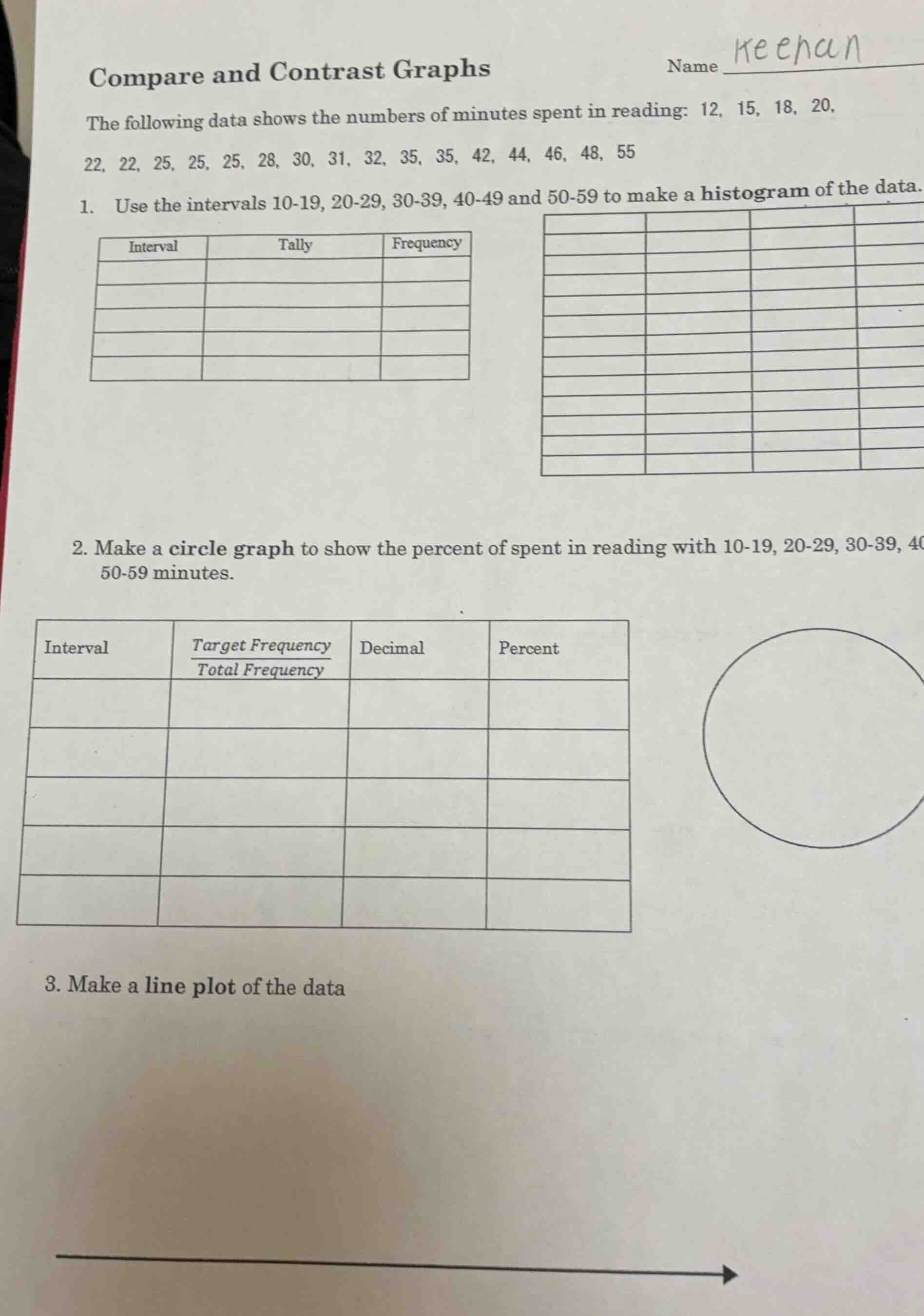
compare and contrast graphs
name
the following data shows the numbers of minutes spent in reading: 12, 15, 18, 20, 22, 22, 25, 25, 25, 28, 30, 31, 32, 35, 35, 42, 44, 46, 48, 55
- use the intervals 10 - 19, 20 - 29, 30 - 39, 40 - 49 and 50 - 59 to make a histogram of the data.
- make a circle graph to show the percent of spent in reading with 10 - 19, 20 - 29, 30 - 39, 40 - 49, 50 - 59 minutes.
- make a line plot of the data
Part 1: Histogram (Tally and Frequency Table)
Step1: Identify data in each interval
- 10 - 19: 12, 15, 18 → 3 values
- 20 - 29: 20, 22, 22, 25, 25, 25, 28 → 7 values
- 30 - 39: 30, 31, 32, 35, 35 → 5 values
- 40 - 49: 42, 44, 46, 48 → 4 values
- 50 - 59: 55 → 1 value
Step2: Create tally marks
- 10 - 19: ||| (3)
- 20 - 29: |||| || (7)
- 30 - 39: |||| | (5)
- 40 - 49: |||| (4)
- 50 - 59: | (1)
Step3: Record frequencies
| Interval | Tally | Frequency | ||||||
|---|---|---|---|---|---|---|---|---|
| 20 - 29 | 7 | |||||||
| 30 - 39 | 5 | |||||||
| 40 - 49 | 4 | |||||||
| 50 - 59 | 1 |
To make the histogram, draw bars for each interval with heights equal to their frequencies. The x - axis is the intervals (10 - 19, 20 - 29, etc.) and the y - axis is frequency.
Part 2: Circle Graph (Pie Chart)
Step1: Find total frequency
Total data points: \(3 + 7+5 + 4+1=20\)
Step2: Calculate \(\frac{\text{Target Frequency}}{\text{Total Frequency}}\), decimal, and percent for each interval
- 10 - 19: \(\frac{3}{20}=0.15 = 15\%\)
- 20 - 29: \(\frac{7}{20}=0.35 = 35\%\)
- 30 - 39: \(\frac{5}{20}=0.25 = 25\%\)
- 40 - 49: \(\frac{4}{20}=0.20 = 20\%\)
- 50 - 59: \(\frac{1}{20}=0.05 = 5\%\)
| Interval | \(\frac{\text{Target Frequency}}{\text{Total Frequency}}\) | Decimal | Percent |
|---|---|---|---|
| 20 - 29 | \(\frac{7}{20}\) | 0.35 | 35% |
| 30 - 39 | \(\frac{5}{20}\) | 0.25 | 25% |
| 40 - 49 | \(\frac{4}{20}\) | 0.20 | 20% |
| 50 - 59 | \(\frac{1}{20}\) | 0.05 | 5% |
To make the circle graph, calculate the central angle for each interval (\(360^{\circ}\times\text{decimal}\)):
- 10 - 19: \(360\times0.15 = 54^{\circ}\)
- 20 - 29: \(360\times0.35 = 126^{\circ}\)
- 30 - 39: \(360\times0.25 = 90^{\circ}\)
- 40 - 49: \(360\times0.20 = 72^{\circ}\)
- 50 - 59: \(360\times0.05 = 18^{\circ}\)
Then draw a circle and divide it into sectors with these central angles, labeling each with the interval and percent.
Part 3: Line Plot
- A line plot (dot plot) has a number line that includes all the data values (12, 15, 18, 20, 22, 25, 28, 30, 31, 32, 35, 42, 44, 46, 48, 55).
- For each data value, place a dot (or X) above the corresponding number on the number line. If a value repeats, stack the dots.
- For example:
- Above 12: 1 dot
- Above 15: 1 dot
- Above 18: 1 dot
- Above 20: 1 dot
- Above 22: 2 dots
- Above 25: 3 dots
- Above 28: 1 dot
- Above 30: 1 dot
- Above 31: 1 dot
- Above 32: 1 dot
- Above 35: 2 dots
- Above 42: 1 dot
- Above 44: 1 dot
- Above 46: 1 dot
- Above 48: 1 dot
- Above 55: 1 dot
Final Answers (Summarized for each part)
- Histogram: Tally and frequency table as above, histogram with bars of heights 3, 7, 5, 4, 1 for intervals 10 - 19, 20 - 29, 30 - 39, 40 - 49, 50 - 59 respectively.
- Circle Graph: Table with percentages 15%, 35%, 25%, 20%, 5% for intervals 10 - 19, 20 - 29, 30 - 39, 40 - 49, 50 - 59 respectively, and sectors with central angles \(54^{\circ}\), \(126^{\circ}\), \(90^{\circ}\), \(72^{\circ}\), \(18^{\circ}\).
- Line Plot: Dot plot with dots stacked above each data value as described.

Snap & solve any problem in the app
Get step-by-step solutions on Sovi AI
Photo-based solutions with guided steps
Explore more problems and detailed explanations
- A line plot (dot plot) has a number line that includes all the data values (12, 15, 18, 20, 22, 25, 28, 30, 31, 32, 35, 42, 44, 46, 48, 55).
- For each data value, place a dot (or X) above the corresponding number on the number line. If a value repeats, stack the dots.
- For example:
- Above 12: 1 dot
- Above 15: 1 dot
- Above 18: 1 dot
- Above 20: 1 dot
- Above 22: 2 dots
- Above 25: 3 dots
- Above 28: 1 dot
- Above 30: 1 dot
- Above 31: 1 dot
- Above 32: 1 dot
- Above 35: 2 dots
- Above 42: 1 dot
- Above 44: 1 dot
- Above 46: 1 dot
- Above 48: 1 dot
- Above 55: 1 dot
Final Answers (Summarized for each part)
- Histogram: Tally and frequency table as above, histogram with bars of heights 3, 7, 5, 4, 1 for intervals 10 - 19, 20 - 29, 30 - 39, 40 - 49, 50 - 59 respectively.
- Circle Graph: Table with percentages 15%, 35%, 25%, 20%, 5% for intervals 10 - 19, 20 - 29, 30 - 39, 40 - 49, 50 - 59 respectively, and sectors with central angles \(54^{\circ}\), \(126^{\circ}\), \(90^{\circ}\), \(72^{\circ}\), \(18^{\circ}\).
- Line Plot: Dot plot with dots stacked above each data value as described.