QUESTION IMAGE
Question
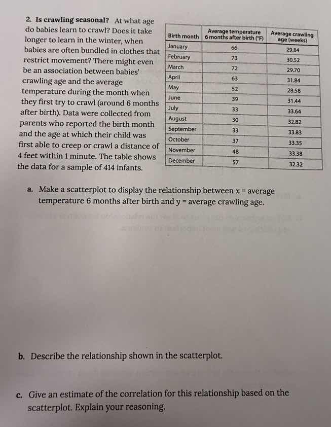
- is crawling seasonal? at what age do babies learn to crawl? does it take longer to learn in the winter, when babies are often bundled in clothes that restrict movement? there might even be an association between babies crawling age and the average temperature during the month when they first try to crawl (around 6 months after birth). data were collected from parents who reported the birth month and the age at which their child was first able to creep or crawl a distance of 4 feet within 1 minute. the table shows the data for a sample of 414 infants.
| birth month | average temperature 6 months after birth (°f) | average crawling age (weeks) |
|---|---|---|
| february | 73 | 30.52 |
| march | 72 | 29.70 |
| april | 63 | 31.84 |
| may | 52 | 28.56 |
| june | 39 | 31.44 |
| july | 33 | 33.64 |
| august | 30 | 32.82 |
| september | 33 | 33.83 |
| october | 37 | 33.35 |
| november | 48 | 33.38 |
| december | 57 | 32.32 |
a. make a scatterplot to display the relationship between ( x ) = average temperature 6 months after birth and ( y ) = average crawling age.
b. describe the relationship shown in the scatterplot.
c. give an estimate of the correlation for this relationship based on the scatterplot. explain your reasoning.
Part a: Making the Scatterplot
To create a scatterplot, we use the two variables: \( x \) (average temperature 6 months after birth, in °F) and \( y \) (average crawling age, in weeks). Each data point corresponds to a birth month, with \( x \)-coordinate as the average temperature and \( y \)-coordinate as the average crawling age.
- Identify Variables:
- Independent variable (\( x \)): Average temperature 6 months after birth (°F)
- Dependent variable (\( y \)): Average crawling age (weeks)
- Plot Points: For each birth month (January to December), plot the point \((x, y)\) where \( x \) is from the "Average temperature 6 months after birth" column and \( y \) is from the "Average crawling age" column. For example:
- January: \((66, 29.84)\)
- February: \((73, 30.52)\)
- March: \((72, 29.70)\)
- April: \((63, 31.84)\)
- May: \((52, 28.56)\)
- June: \((39, 31.44)\)
- July: \((33, 33.64)\)
- August: \((30, 32.82)\)
- September: \((33, 33.83)\)
- October: \((37, 33.35)\)
- November: \((48, 33.38)\)
- December: \((57, 32.32)\)
- Label Axes:
- \( x \)-axis: "Average temperature 6 months after birth (°F)"
- \( y \)-axis: "Average crawling age (weeks)"
(Note: A visual scatterplot would be drawn with these points, but the description above outlines the process.)
Part b: Describing the Relationship
To describe the relationship between \( x \) (temperature) and \( y \) (crawling age), we analyze the direction, form, and strength of the association:
- Direction: As the average temperature 6 months after birth ( \( x \) ) decreases, the average crawling age ( \( y \) ) generally increases. This is a negative association (inverse relationship).
- Form: The relationship appears to be somewhat linear, but with some scatter. There isn't a perfect straight-line pattern, but the overall trend follows a linear-like trend (negative slope).
- Strength: The association is moderately strong. While there is some scatter in the points, the general trend of decreasing temperature with increasing crawling age is noticeable. There are a few deviations (e.g., May has a low temperature but relatively low crawling age, June has a low temperature but moderate crawling age), but the overall pattern is consistent.
Part c: Estimating the Correlation
Correlation (\( r \)) measures the strength and direction of a linear relationship between two quantitative variables. The value of \( r \) ranges from -1 (perfect negative linear relationship) to 1 (perfect positive linear relationship), with 0 indicating no linear relationship.
- Direction: The relationship is negative (as \( x \) increases, \( y \) decreases), so \( r \) will be negative.
- Strength: The association is moderately strong (not perfect, but a clear trend). A perfect negative linear relationship has \( r = -1 \), and a weak negative relationship might be around \( r = -0.3 \) to \( -0.5 \). Given the moderate scatter but a noticeable linear trend, an estimate for \( r \) could be around \( -0.7 \) (moderately strong negative correlation) or between \( -0.6 \) and \( -0.8 \).
Justification: The scatterplot shows a general linear trend with a negative slope, and while there is some scatter, the points cluster around a line with a noticeable negative association. This suggests a correlation that is negative and moderately strong (not extremely weak or extremely strong).
Final Answers (Summarized)
Part a:
A scatterplot is created by plotting the points \((\text{average temperature}, \text{average crawling age})\) for each birth month, with labeled axes for temperature (x-axis) and crawling age (y-axis).
Part b:
The relationship between average temperature 6 months after birth and average crawling age is a moderately strong, negative, linear association (with some scatter). As temperature decreases, crawling age tends to increase.
Part c:
An estimated correlation \( r \) is around \(\boldsymbol{-0.7}\) (or between \(-0.6\) and \(-0.8\)), reflecting a moderately strong negative linear relationship. The negative sign indicates the inverse trend, and the magnitude (close to 1 but not 1) reflects the moderate strength (not perfect, but noticeable).

Snap & solve any problem in the app
Get step-by-step solutions on Sovi AI
Photo-based solutions with guided steps
Explore more problems and detailed explanations
Correlation (\( r \)) measures the strength and direction of a linear relationship between two quantitative variables. The value of \( r \) ranges from -1 (perfect negative linear relationship) to 1 (perfect positive linear relationship), with 0 indicating no linear relationship.
- Direction: The relationship is negative (as \( x \) increases, \( y \) decreases), so \( r \) will be negative.
- Strength: The association is moderately strong (not perfect, but a clear trend). A perfect negative linear relationship has \( r = -1 \), and a weak negative relationship might be around \( r = -0.3 \) to \( -0.5 \). Given the moderate scatter but a noticeable linear trend, an estimate for \( r \) could be around \( -0.7 \) (moderately strong negative correlation) or between \( -0.6 \) and \( -0.8 \).
Justification: The scatterplot shows a general linear trend with a negative slope, and while there is some scatter, the points cluster around a line with a noticeable negative association. This suggests a correlation that is negative and moderately strong (not extremely weak or extremely strong).
Final Answers (Summarized)
Part a:
A scatterplot is created by plotting the points \((\text{average temperature}, \text{average crawling age})\) for each birth month, with labeled axes for temperature (x-axis) and crawling age (y-axis).
Part b:
The relationship between average temperature 6 months after birth and average crawling age is a moderately strong, negative, linear association (with some scatter). As temperature decreases, crawling age tends to increase.
Part c:
An estimated correlation \( r \) is around \(\boldsymbol{-0.7}\) (or between \(-0.6\) and \(-0.8\)), reflecting a moderately strong negative linear relationship. The negative sign indicates the inverse trend, and the magnitude (close to 1 but not 1) reflects the moderate strength (not perfect, but noticeable).