QUESTION IMAGE
Question
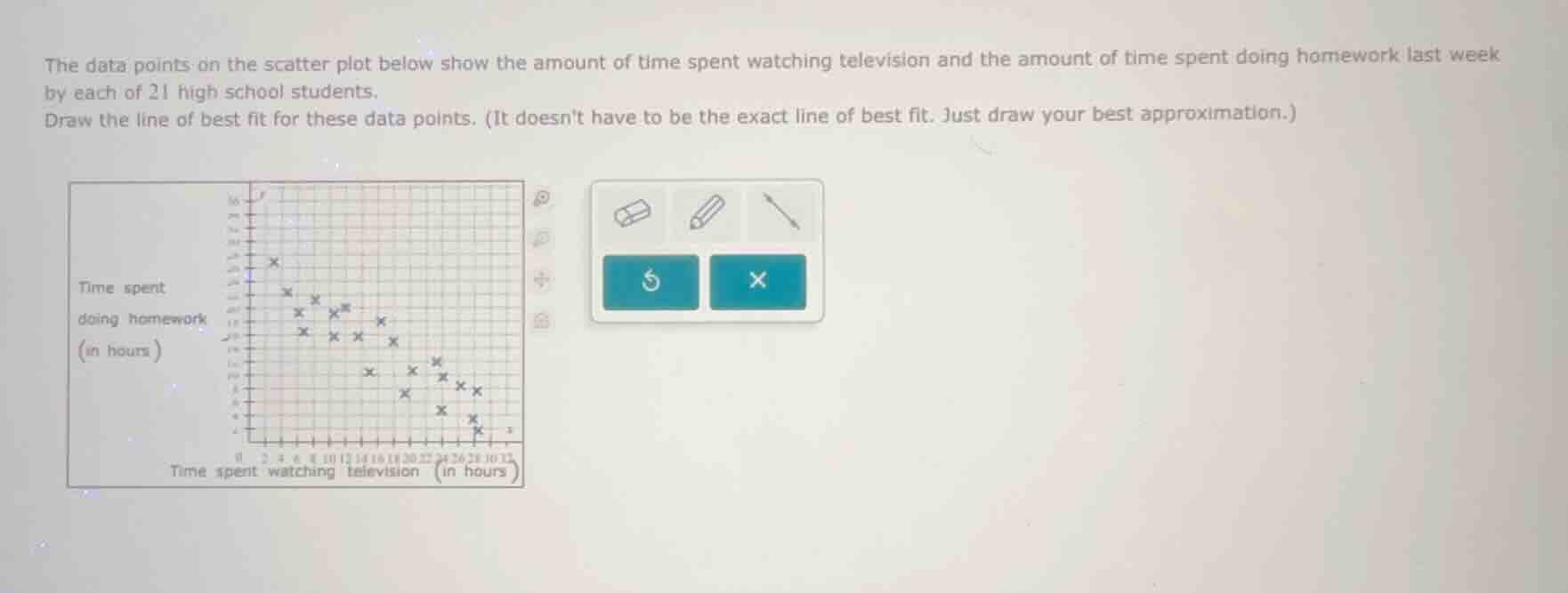
the data points on the scatter plot below show the amount of time spent watching television and the amount of time spent doing homework last week by each of 21 high school students. draw the line of best fit for these data points. (it doesnt have to be the exact line of best fit. just draw your best approximation.)
Step1: Identify Trend
The scatter plot shows a negative correlation (as TV time increases, homework time decreases).
Step2: Approximate Line
Draw a line that roughly splits the data points, with a negative slope, passing through the middle of the cluster of points. For example, it might pass near the upper - left points (low TV time, high homework time) and lower - right points (high TV time, low homework time), balancing the number of points above and below the line.

Snap & solve any problem in the app
Get step-by-step solutions on Sovi AI
Photo-based solutions with guided steps
Explore more problems and detailed explanations
To draw the line of best fit, follow these visual steps:
- Observe the general trend of the data (negative correlation: as time spent watching television increases, time spent doing homework decreases).
- Sketch a straight line that approximately balances the number of data points above and below it. The line should have a negative slope, starting from a relatively high \(y\) - value (homework time) when \(x\) (TV time) is low and ending at a relatively low \(y\) - value when \(x\) is high. (Since this is a drawing task, the actual line will be a visual approximation on the scatter plot grid provided.)