QUESTION IMAGE
Question
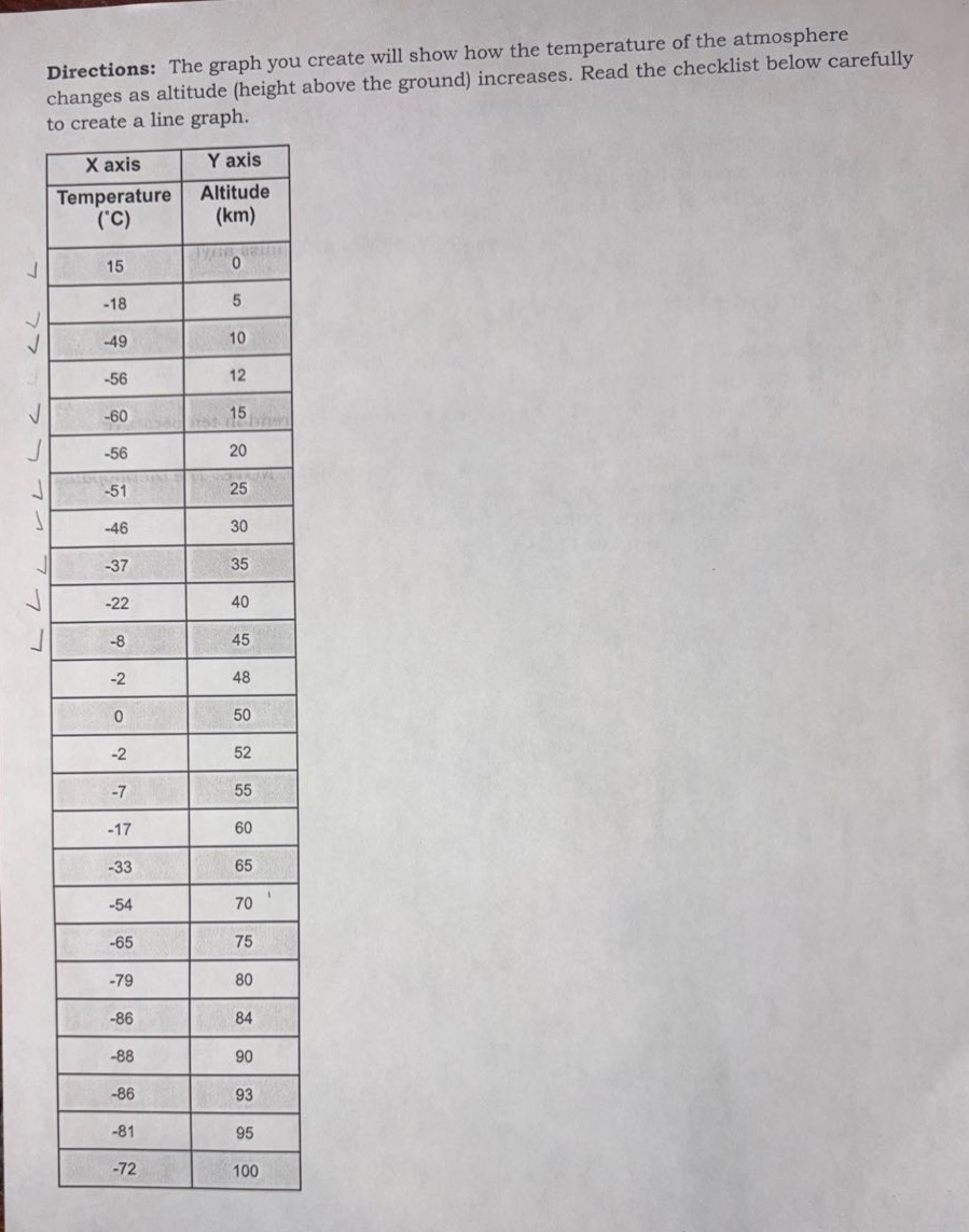
directions: the graph you create will show how the temperature of the atmosphere changes as altitude (height above the ground) increases. read the checklist below carefully to create a line graph.
x axis (temperature (°c)) | y axis (altitude (km))
15 | 0
-18 | 5
-49 | 10
-56 | 12
-60 | 15
-56 | 20
-51 | 25
-46 | 30
-37 | 35
-22 | 40
-8 | 45
-2 | 48
0 | 50
-2 | 52
-7 | 55
-17 | 60
-33 | 65
-54 | 70
-65 | 75
-79 | 80
-86 | 84
-88 | 90
-86 | 93
-81 | 95
-72 | 100
To create the line graph, we follow these steps:
Step 1: Set up the axes
- X - axis (Horizontal): Represents temperature in degrees Celsius ($^\circ$C). We need to determine an appropriate scale. The temperature values range from - 88$^\circ$C to 15$^\circ$C. A reasonable scale could be from - 90$^\circ$C to 20$^\circ$C with intervals of 10$^\circ$C (or smaller if needed for clarity).
- Y - axis (Vertical): Represents altitude in kilometers (km). The altitude values range from 0 km to 100 km. A scale from 0 km to 100 km with intervals of 5 km (or 10 km) would work.
Step 2: Plot the data points
For each pair of (Temperature, Altitude) values from the table:
- For example, the first data point is (15, 0), which means at an altitude of 0 km (ground level), the temperature is 15$^\circ$C. We mark this point on the graph where the x - coordinate is 15 (on the temperature axis) and the y - coordinate is 0 (on the altitude axis).
- The second data point is (- 18, 5), so we find the position on the graph where x=-18 (temperature) and y = 5 (altitude) and mark it.
- We continue this process for all the data points: (- 49, 10), (- 56, 12), (- 60, 15), (- 56, 20), (- 51, 25), (- 46, 30), (- 37, 35), (- 22, 40), (- 8, 45), (- 2, 48), (0, 50), (- 2, 52), (- 7, 55), (- 17, 60), (- 33, 65), (- 54, 70), (- 65, 75), (- 79, 80), (- 86, 84), (- 88, 90), (- 86, 93), (- 81, 95), (- 72, 100)
Step 3: Draw the line
After plotting all the points, we use a ruler to draw a smooth line (or a series of line segments) connecting the plotted points in the order of increasing altitude (since altitude is the independent variable here, and we are showing how temperature changes as altitude increases).
Step 4: Add labels and title
- Title: "Temperature vs. Altitude in the Atmosphere"
- X - axis label: "Temperature ($^\circ$C)"
- Y - axis label: "Altitude (km)"
If we were to describe the general shape of the graph:
- From 0 km to 15 km, the temperature decreases as altitude increases (from 15$^\circ$C to - 60$^\circ$C).
- From 15 km to 20 km, the temperature remains relatively constant (around - 56$^\circ$C to - 60$^\circ$C).
- From 20 km to 45 km, the temperature starts to increase as altitude increases (from - 56$^\circ$C to - 8$^\circ$C).
- From 45 km to 90 km, the temperature decreases again (from - 8$^\circ$C to - 88$^\circ$C).
- From 90 km to 100 km, the temperature increases slightly (from - 88$^\circ$C to - 72$^\circ$C).
(Note: Since the question was about creating the graph, the above steps outline the process. If you need to actually draw the graph on paper or using software, you can use graphing tools like Excel, Google Sheets, or a graphing calculator to input the data and generate the line graph.)

Snap & solve any problem in the app
Get step-by-step solutions on Sovi AI
Photo-based solutions with guided steps
Explore more problems and detailed explanations
To create the line graph, we follow these steps:
Step 1: Set up the axes
- X - axis (Horizontal): Represents temperature in degrees Celsius ($^\circ$C). We need to determine an appropriate scale. The temperature values range from - 88$^\circ$C to 15$^\circ$C. A reasonable scale could be from - 90$^\circ$C to 20$^\circ$C with intervals of 10$^\circ$C (or smaller if needed for clarity).
- Y - axis (Vertical): Represents altitude in kilometers (km). The altitude values range from 0 km to 100 km. A scale from 0 km to 100 km with intervals of 5 km (or 10 km) would work.
Step 2: Plot the data points
For each pair of (Temperature, Altitude) values from the table:
- For example, the first data point is (15, 0), which means at an altitude of 0 km (ground level), the temperature is 15$^\circ$C. We mark this point on the graph where the x - coordinate is 15 (on the temperature axis) and the y - coordinate is 0 (on the altitude axis).
- The second data point is (- 18, 5), so we find the position on the graph where x=-18 (temperature) and y = 5 (altitude) and mark it.
- We continue this process for all the data points: (- 49, 10), (- 56, 12), (- 60, 15), (- 56, 20), (- 51, 25), (- 46, 30), (- 37, 35), (- 22, 40), (- 8, 45), (- 2, 48), (0, 50), (- 2, 52), (- 7, 55), (- 17, 60), (- 33, 65), (- 54, 70), (- 65, 75), (- 79, 80), (- 86, 84), (- 88, 90), (- 86, 93), (- 81, 95), (- 72, 100)
Step 3: Draw the line
After plotting all the points, we use a ruler to draw a smooth line (or a series of line segments) connecting the plotted points in the order of increasing altitude (since altitude is the independent variable here, and we are showing how temperature changes as altitude increases).
Step 4: Add labels and title
- Title: "Temperature vs. Altitude in the Atmosphere"
- X - axis label: "Temperature ($^\circ$C)"
- Y - axis label: "Altitude (km)"
If we were to describe the general shape of the graph:
- From 0 km to 15 km, the temperature decreases as altitude increases (from 15$^\circ$C to - 60$^\circ$C).
- From 15 km to 20 km, the temperature remains relatively constant (around - 56$^\circ$C to - 60$^\circ$C).
- From 20 km to 45 km, the temperature starts to increase as altitude increases (from - 56$^\circ$C to - 8$^\circ$C).
- From 45 km to 90 km, the temperature decreases again (from - 8$^\circ$C to - 88$^\circ$C).
- From 90 km to 100 km, the temperature increases slightly (from - 88$^\circ$C to - 72$^\circ$C).
(Note: Since the question was about creating the graph, the above steps outline the process. If you need to actually draw the graph on paper or using software, you can use graphing tools like Excel, Google Sheets, or a graphing calculator to input the data and generate the line graph.)