QUESTION IMAGE
Question
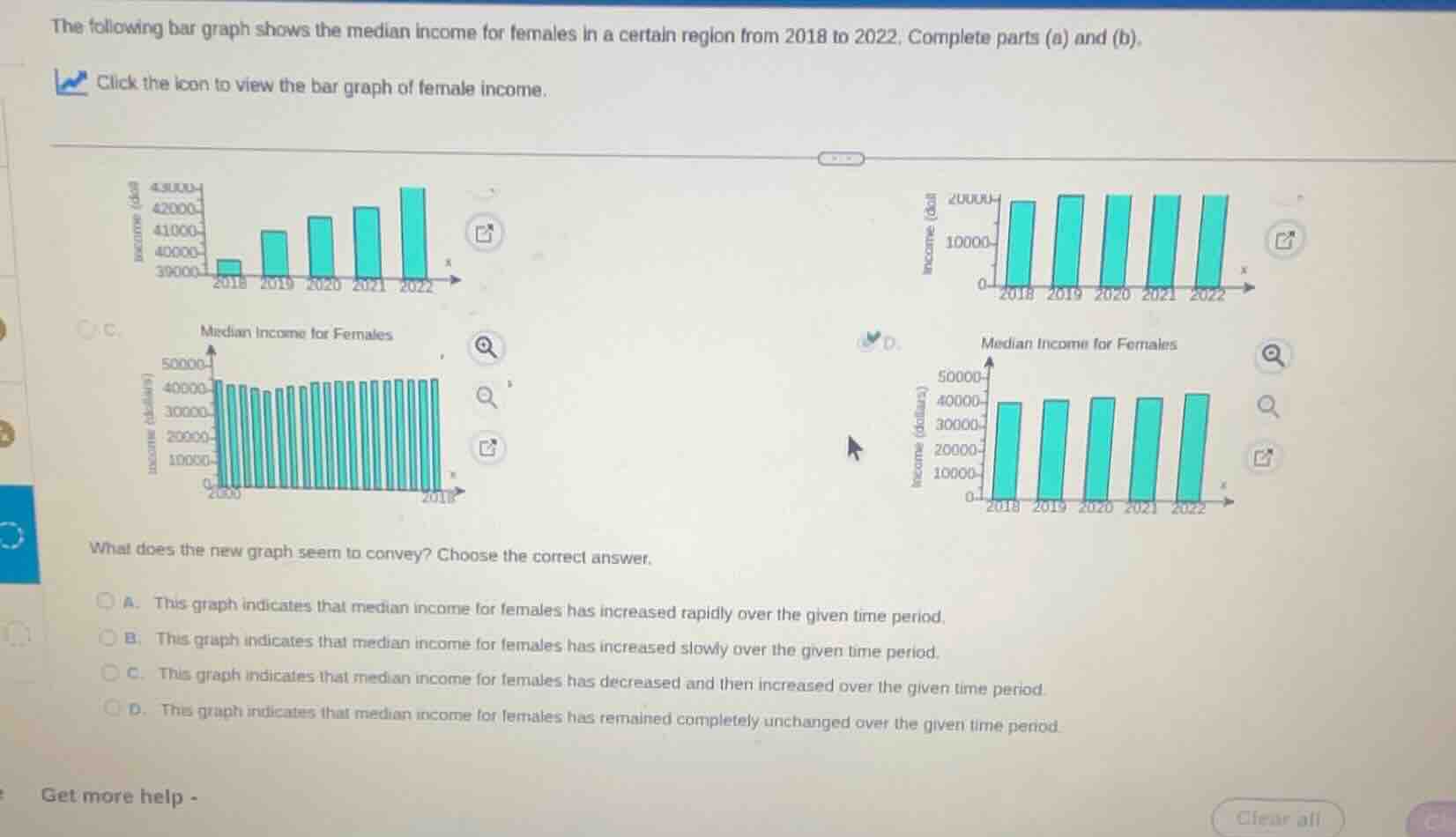
the following bar graph shows the median income for females in a certain region from 2018 to 2022. complete parts (a) and (b). click the icon to view the bar graph of female income. what does the new graph seem to convey? choose the correct answer. a. this graph indicates that median income for females has increased rapidly over the given time period. b. this graph indicates that median income for females has increased slowly over the given time period. c. this graph indicates that median income for females has decreased and then increased over the given time period. d. this graph indicates that median income for females has remained completely unchanged over the given time period.
To determine what the graph conveys, we analyze the median income for females from 2018 - 2022. The bars in the graph (the last one shown with 2018 - 2022) have heights that are relatively close, with a slight increase over time. Option A says "rapidly" which is incorrect as the increase is not rapid. Option C says "decreased and then increased" but the graph shows a general slight upward trend, not a decrease then increase. Option D says "completely unchanged" which is wrong as there is a slight increase. Option B says "increased slowly" which matches the visual of the bars having a small upward trend over the years.

Snap & solve any problem in the app
Get step-by-step solutions on Sovi AI
Photo-based solutions with guided steps
Explore more problems and detailed explanations
B. This graph indicates that median income for females has increased slowly over the given time period.