QUESTION IMAGE
Question
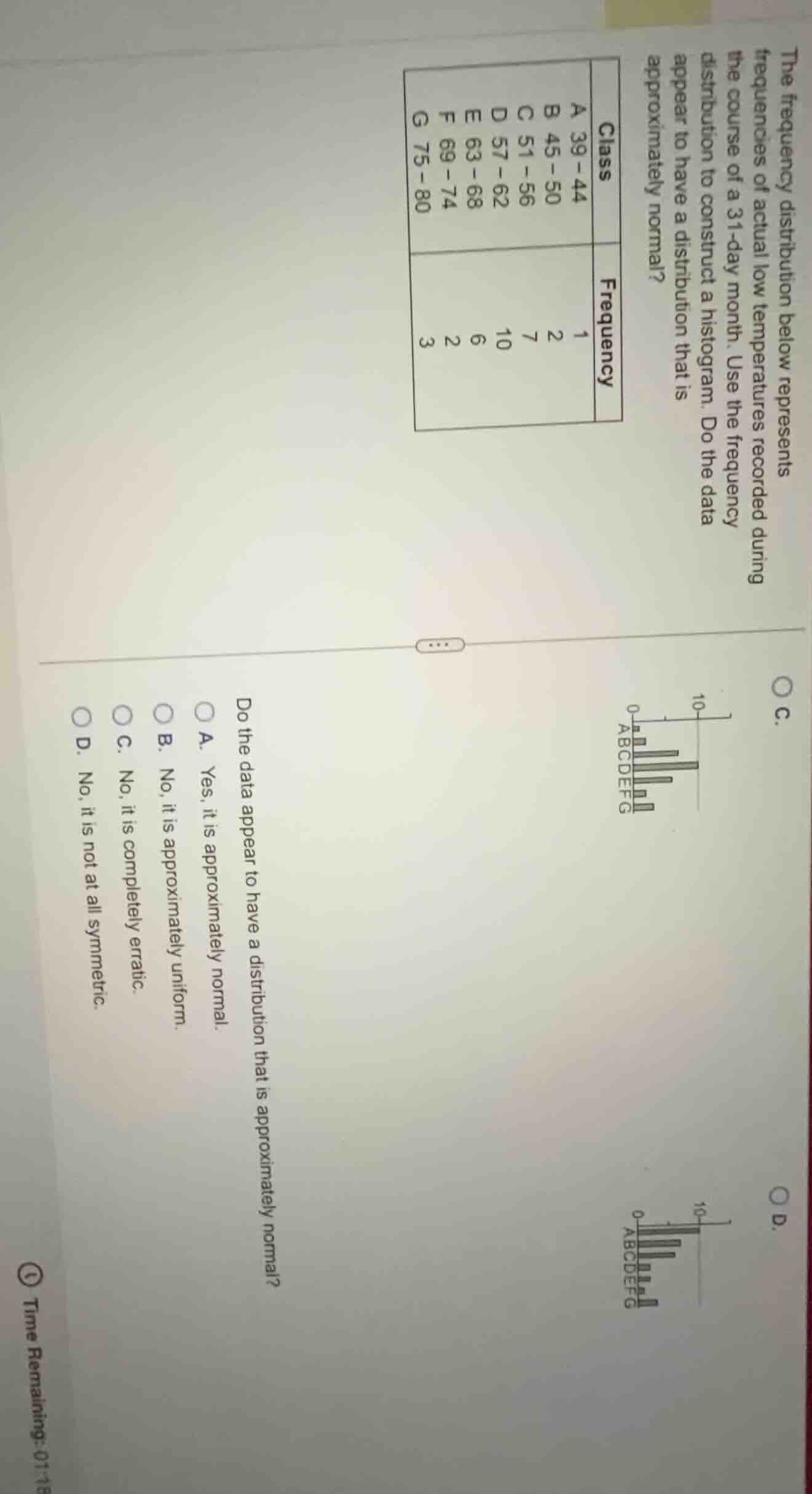
the frequency distribution below represents the frequencies of actual low temperatures recorded during the course of a 31 - day month. use the frequency distribution to construct a histogram. do the data appear to have a distribution that is approximately normal?
class | frequency
a 39 - 44 | 1
b 45 - 50 | 2
c 51 - 56 | 7
d 57 - 62 | 10
e 63 - 68 | 6
f 69 - 74 | 2
g 75 - 80 | 3
do the data appear to have a distribution that is approximately normal?
a. yes, it is approximately normal.
b. no, it is approximately uniform.
c. no, it is completely erratic.
d. no, it is not at all symmetric.
A normal distribution's histogram is bell - shaped, with frequencies increasing to a peak and then decreasing symmetrically. Here, frequencies start at 1 (A), increase to 10 (D), then decrease (E:6, F:2, G:3). The left - side frequencies (A:1, B:2, C:7) and right - side (E:6, F:2, G:3) show a roughly symmetric pattern around the peak at D. So the data has an approximately normal distribution.

Snap & solve any problem in the app
Get step-by-step solutions on Sovi AI
Photo-based solutions with guided steps
Explore more problems and detailed explanations
A. Yes, it is approximately normal.