QUESTION IMAGE
Question
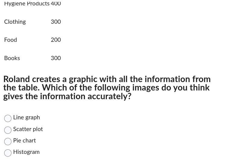
hygiene products 400
clothing 300
food 200
books 300
roland creates a graphic with all the information from the table. which of the following images do you think gives the information accurately?
line graph
scatter plot
pie chart
histogram
The data shows categorical groups (Hygiene Products, Clothing, etc.) with corresponding numerical values representing parts of a total. A pie chart is designed to display proportional data as slices of a whole, making it the accurate choice here. Line graphs track trends over time, scatter plots show relationships between two variables, and histograms represent frequency distributions of continuous data, which do not fit this categorical proportional data.

Snap & solve any problem in the app
Get step-by-step solutions on Sovi AI
Photo-based solutions with guided steps
Explore more problems and detailed explanations
Pie chart