QUESTION IMAGE
Question
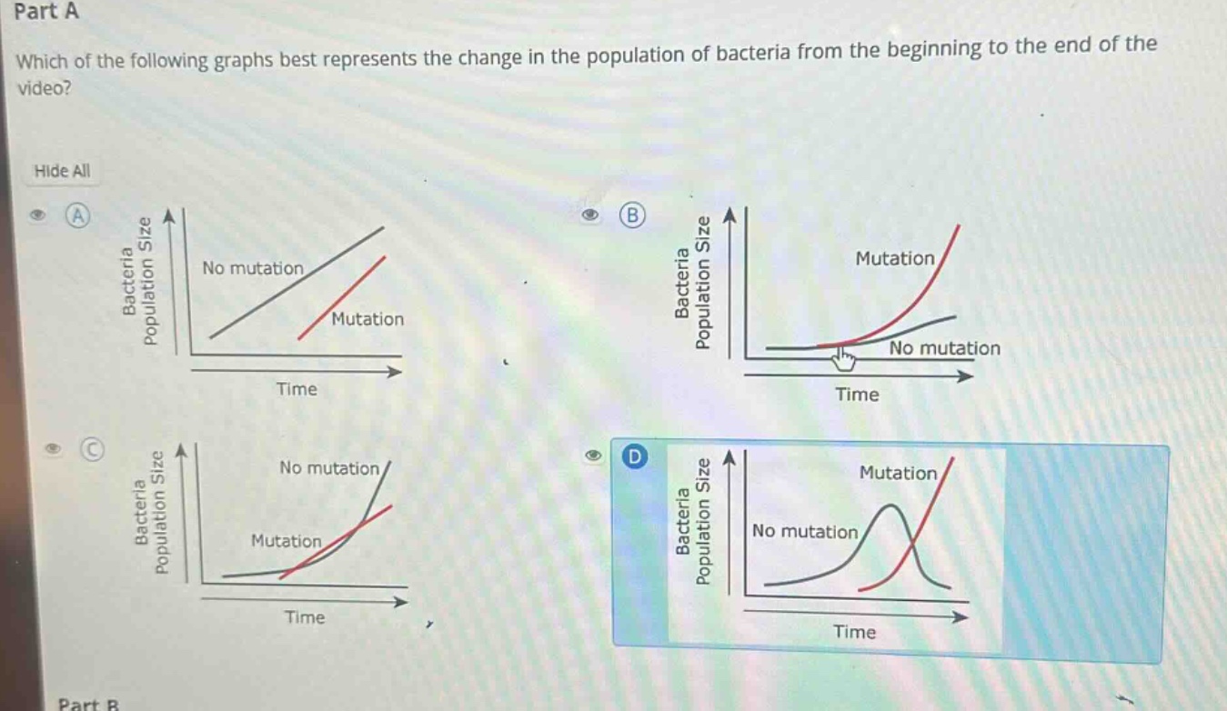
part a
which of the following graphs best represents the change in the population of bacteria from the beginning to the end of the video?
graph a: two lines, labeled no mutation (black, steeper) and mutation (red, starts later, less steep), with axes bacteria population size (y) and time (x).
graph b: two lines, labeled mutation (red, steeply curved upward) and no mutation (black, shallowly curved upward), with axes bacteria population size (y) and time (x).
graph c: two lines, labeled no mutation (black, steeply curved upward) and mutation (red, steeper curve starting later), with axes bacteria population size (y) and time (x).
graph d: two lines, labeled no mutation (black, curve peaking then declining) and mutation (red, steeply increasing), with axes bacteria population size (y) and time (x).
part b
In bacterial population dynamics, when a mutation occurs that confers a survival or reproductive advantage (e.g., resistance to an antibiotic, though the context here is general growth advantage), the mutated population should grow exponentially faster than the non - mutated one over time.
- Graph A shows linear growth, which is not typical for bacterial population growth (bacterial growth is usually exponential).
- Graph B: The non - mutated population has a very low growth rate and the mutated one starts growing later but then exponentially. However, in a more typical scenario, both populations start growing from the start, and the mutated one with an advantage should overtake the non - mutated.
- Graph C: Both populations show exponential growth, and the mutated population (with an advantage) grows faster and overtakes the non - mutated one, which is consistent with the idea of a beneficial mutation leading to a higher growth rate (exponential growth, and the mutated population outpaces the non - mutated as time goes on).
- Graph D shows the non - mutated population peaking and then declining, which is not a typical pattern for a simple bacterial population growth with and without a mutation (unless there are external factors like resource depletion, but the question is about the change from beginning to end of the video, likely a scenario of growth with a beneficial mutation). So Graph C best represents the situation where the mutated bacterial population, with a growth advantage, grows exponentially and overtakes the non - mutated population.

Snap & solve any problem in the app
Get step-by-step solutions on Sovi AI
Photo-based solutions with guided steps
Explore more problems and detailed explanations
C. The graph where the "Mutation" (red) curve shows exponential growth and overtakes the "No mutation" (black) curve, representing the mutated bacterial population growing faster (exponentially) and surpassing the non - mutated population over time.