QUESTION IMAGE
Question
question
part 2 of 3
completed: 20 of 27
my score: 19.8/27 pts (73.35%)
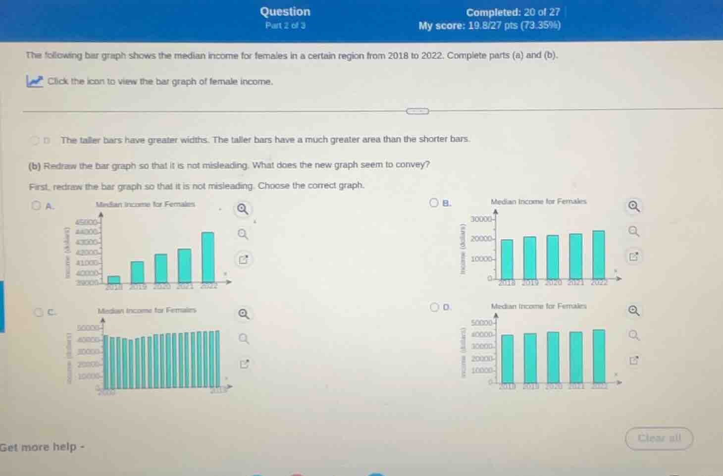
the following bar graph shows the median income for females in a certain region from 2018 to 2022. complete parts (a) and (b).
click the icon to view the bar graph of female income.
d the taller bars have greater widths. the taller bars have a much greater area than the shorter bars.
(b) redraw the bar graph so that it is not misleading. what does the new graph seem to convey?
first, redraw the bar graph so that it is not misleading. choose the correct graph.
a. median income for females
b. median income for females
c. median income for females
d. median income for females
get more help -
clear all
To redraw a non - misleading bar graph for median female income from 2018 - 2022, we need to have a consistent scale on the y - axis (income) and uniform bar widths. Option D has a proper y - axis scale (starting from 0, with appropriate intervals) and uniform bar widths, which allows for an accurate comparison of median incomes across the years. It conveys that the median income for females has a relatively steady or slightly increasing trend from 2018 to 2022, as the bar heights are comparable in their incremental changes when the graph is not misleading.

Snap & solve any problem in the app
Get step-by-step solutions on Sovi AI
Photo-based solutions with guided steps
Explore more problems and detailed explanations
D. Median Income for Females (with the corresponding bar graph having a proper y - axis scale, uniform bar widths, and showing the median income trend from 2018 - 2022 accurately)