QUESTION IMAGE
Question
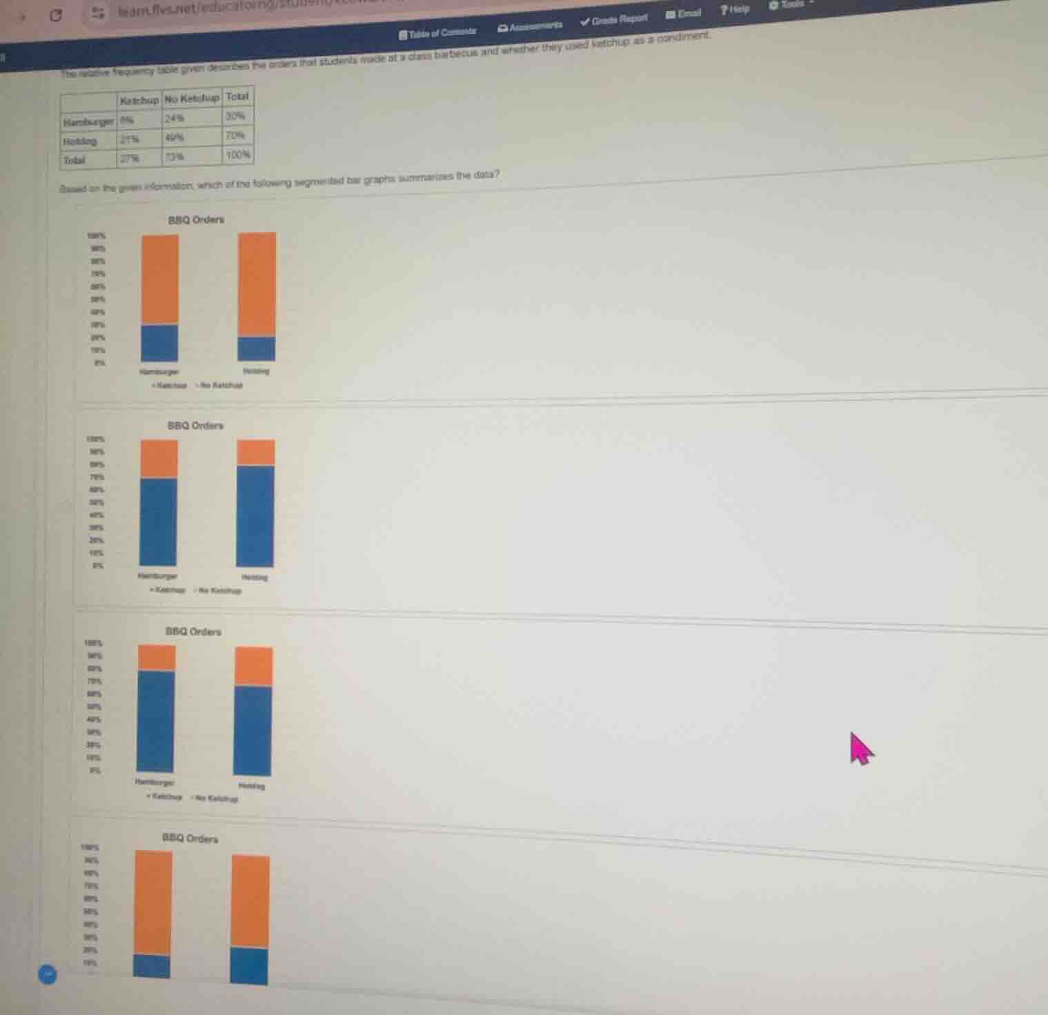
the relative frequency table given describes the orders that students made at a class barbeque and whether they used ketchup as a condiment.
| ketchup | no ketchup | total | |
|---|---|---|---|
| hotdog | 21% | 49% | 70% |
| total | 27% | 73% | 100% |
based on the given information, which of the following segmented bar graphs summarises the data?
Step1: Analyze Hamburger segment
For Hamburgers: Ketchup = 6%, No Ketchup = 24%. So the blue (Ketchup) portion is 6% (small slice), orange (No Ketchup) is 24% of the 30% total bar, meaning orange makes up 80% of the hamburger bar, blue 20%.
Step2: Analyze Hotdog segment
For Hotdogs: Ketchup = 21%, No Ketchup = 49%. So the blue (Ketchup) portion is 21% of the 70% total bar (30% of the hotdog bar), orange (No Ketchup) is 49% of the 70% total bar (70% of the hotdog bar).
Step3: Match to bar graphs
Compare the segment sizes to the options: the fourth graph has a small blue segment (20%) for hamburgers, and a larger blue segment (30%) for hotdogs, matching the calculated proportions.

Snap & solve any problem in the app
Get step-by-step solutions on Sovi AI
Photo-based solutions with guided steps
Explore more problems and detailed explanations
The fourth segmented bar graph (bottom-most one labeled "BBQ Orders") summarises the data.