QUESTION IMAGE
Question
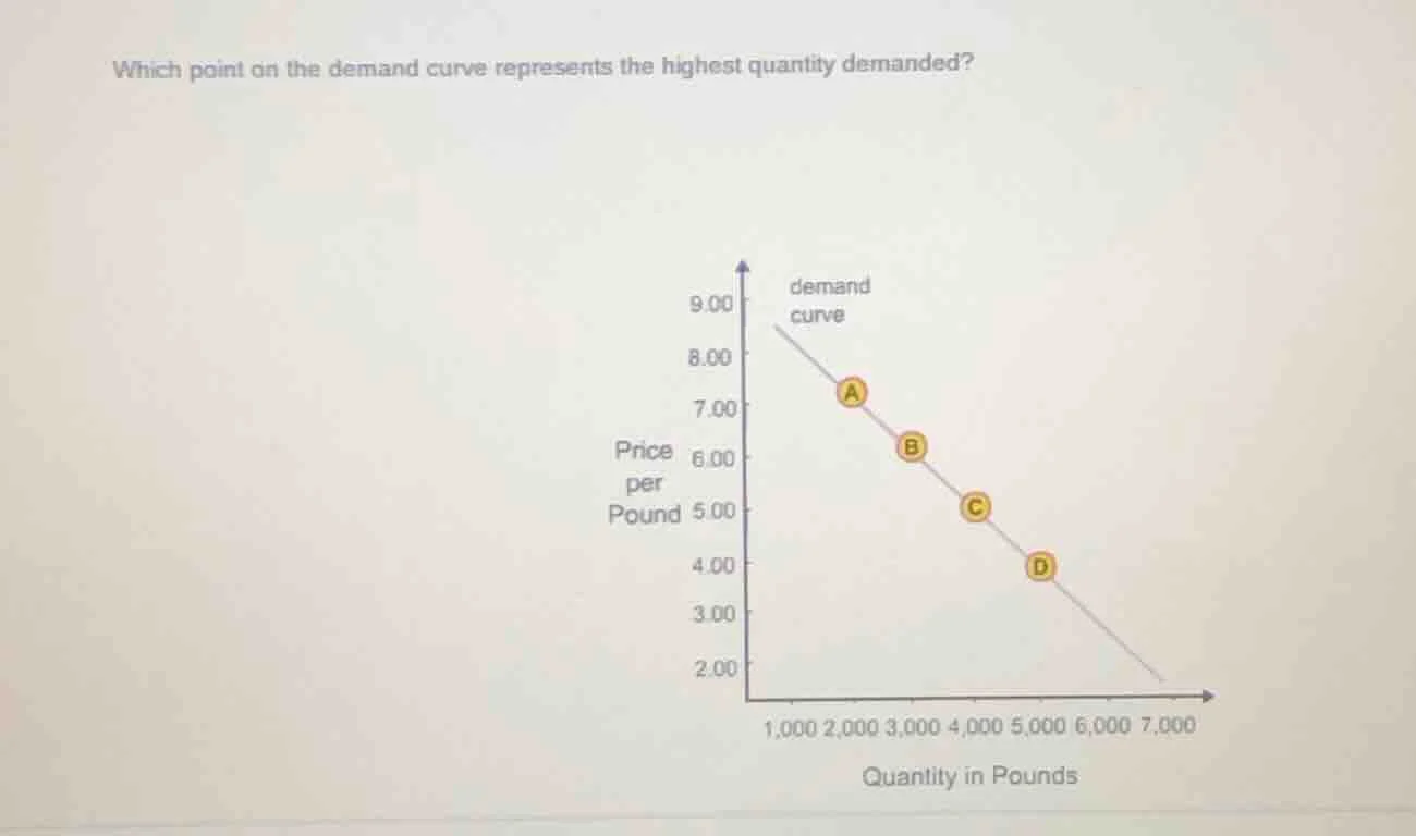
which point on the demand curve represents the highest quantity demanded? demand curve graph with points a, b, c, d, price per pound (y - axis) and quantity in pounds (x - axis)
Step1: Understand the Axes
The x - axis represents quantity (in pounds) and the y - axis represents price (per pound). To find the highest quantity demanded, we look at the x - values of the points on the demand curve.
Step2: Analyze Each Point's Quantity
- Point A: Looking at the x - axis, it is around 2000 pounds.
- Point B: Around 3000 pounds.
- Point C: Around 4000 pounds.
- Point D: Around 5000 pounds. Also, as we move along the demand curve towards the right (lower price), the quantity increases. The rightmost point on the demand curve (where it meets the x - axis) would have the highest quantity, but among the labeled points, D has the highest quantity.

Snap & solve any problem in the app
Get step-by-step solutions on Sovi AI
Photo-based solutions with guided steps
Explore more problems and detailed explanations
D