QUESTION IMAGE
Question
3 apply the skill
directions: study the information and map, read the question, and choose the best answer.
influenza
fever, cough, sore throat, headache, muscle aches, and vomiting—chances are you have had these symptoms at some point. they are symptoms of influenza, or the flu.
the flu is a respiratory illness caused by several types of viruses. every year, scientists predict which flu viruses will be the most prevalent during the next flu season. then vaccines are made to protect against those strains, and scientists hope they have predicted correctly. not everyone gets the flu vaccine, and not everyone who gets the vaccine avoids the flu.
the centers for disease control and prevention tracks estimated flu cases across the country each week to determine how the numbers of infected people are changing. the map shows the results from one week.
weekly influenza surveillance report
map of the united states with alaska and hawaii, legend: local, sporadic, regional, widespread
- which category of geographic spread of the flu applied to the most states during the week addressed by the map?
a. sporadic
b. local
c. regional
d. widespread
directions: study the information and graph, read each question, and choose the best answer.
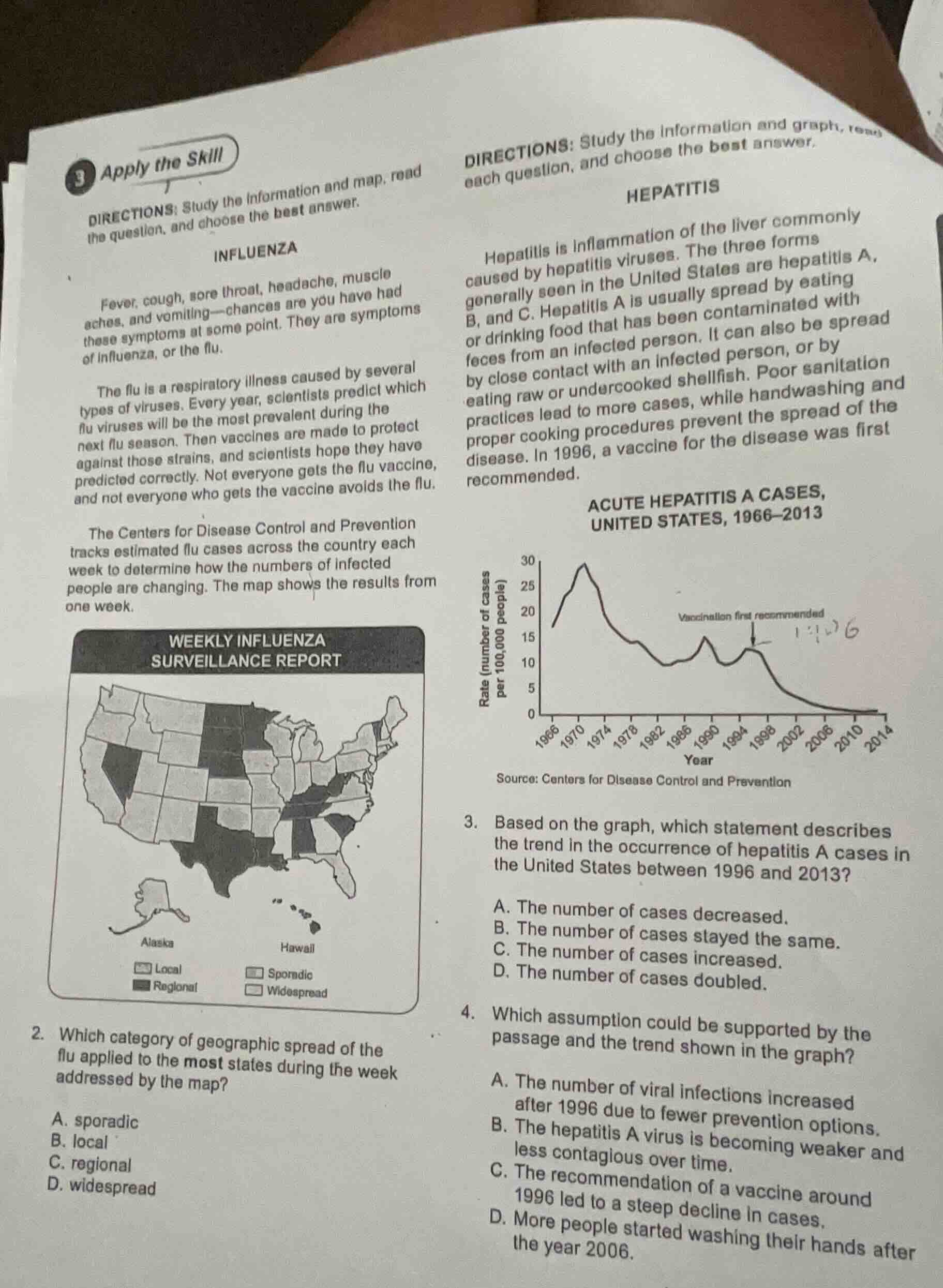
hepatitis
hepatitis is inflammation of the liver commonly caused by hepatitis viruses. the three forms generally seen in the united states are hepatitis a, b, and c. hepatitis a is usually spread by eating or drinking food that has been contaminated with feces from an infected person. it can also be spread by close contact with an infected person, or by eating raw or undercooked shellfish. poor sanitation practices lead to more cases, while handwashing and proper cooking procedures prevent the spread of the disease. in 1996, a vaccine for the disease was first recommended.
acute hepatitis a cases, united states, 1966–2013
line graph: x-axis year (1966–2014), y-axis rate (number of cases per 100,000 people), data shows trend, note: vaccination first recommended 1996
source: centers for disease control and prevention
- based on the graph, which statement describes the trend in the occurrence of hepatitis a cases in the united states between 1996 and 2013?
a. the number of cases decreased.
b. the number of cases stayed the same.
c. the number of cases increased.
d. the number of cases doubled.
- which assumption could be supported by the passage and the trend shown in the graph?
a. the number of viral infections increased after 1996 due to fewer prevention options.
b. the hepatitis a virus is becoming weaker and less contagious over time.
c. the recommendation of a vaccine around 1996 led to a steep decline in cases.
d. more people started washing their hands after the year 2006.
Question 2
To solve this, we analyze the "WEEKLY INFLUENZA SURVEILLANCE REPORT" map. We count the number of states in each category (sporadic, local, regional, widespread). The "sporadic" category (the light - shaded one) appears to cover the most states when visually inspecting the map.
We look at the graph titled "ACUTE HEPATITIS A CASES, UNITED STATES, 1966 - 2013". From 1996 to 2013, the rate (number of cases per 100,000 people) of hepatitis A cases shows a downward trend. So the number of cases decreased during this period.
- Option A: The graph shows a decrease in cases after 1996, not an increase. Also, the passage mentions vaccines as a prevention option, so fewer prevention options don't make sense. Eliminate A.
- Option B: The passage and graph don't provide any information about the virus becoming weaker or less contagious. Eliminate B.
- Option C: The graph shows a steep decline in cases after 1996, and the passage states that a vaccine for hepatitis A was first recommended in 1996. This assumption is supported as the vaccine recommendation likely led to the decline.
- Option D: The passage mentions handwashing as a preventive measure, but the graph's trend after 1996 is related to the vaccine recommendation in 1996, not handwashing starting in 2006. Eliminate D.

Snap & solve any problem in the app
Get step-by-step solutions on Sovi AI
Photo-based solutions with guided steps
Explore more problems and detailed explanations
A. sporadic