QUESTION IMAGE
Question
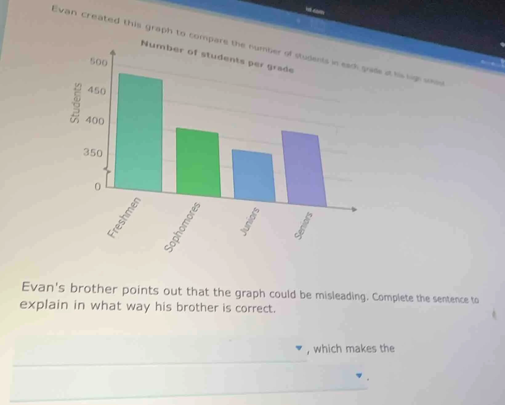
evan created this graph to compare the number of students in each grade at his high school
number of students per grade
evans brother points out that the graph could be misleading. complete the sentence to
explain in what way his brother is correct.
, which makes the
To determine why the graph is misleading, we analyze the y - axis. A common way for a bar graph to be misleading is if the y - axis does not start at 0 (or if the scale is manipulated). In this graph, the y - axis for the number of students starts at a value greater than 0 (it seems to have a break or starts at a non - zero point, maybe around 350 instead of 0). When the y - axis does not start at 0, the differences in the heights of the bars are exaggerated. For example, the bar for freshmen looks much taller relative to the other bars than it would if the y - axis started at 0, which can give a distorted perception of the differences in the number of students per grade.

Snap & solve any problem in the app
Get step-by-step solutions on Sovi AI
Photo-based solutions with guided steps
Explore more problems and detailed explanations
The y - axis does not start at 0, which makes the differences in the number of students per grade appear larger than they actually are.