QUESTION IMAGE
Question
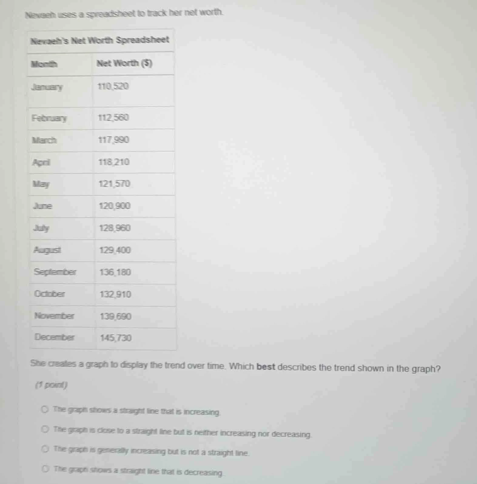
nevaeh uses a spreadsheet to track her net worth.
nevaeh’s net worth spreadsheet
month net worth ($)
january 110,520
february 112,560
march 117,990
april 118,210
may 121,570
june 120,900
july 128,960
august 129,400
september 136,180
october 132,910
november 139,690
december 145,730
she creates a graph to display the trend over time. which best describes the trend shown in the graph?
(1 point)
the graph shows a straight line that is increasing.
the graph is close to a straight line but is neither increasing nor decreasing.
the graph is generally increasing but is not a straight line.
the graph shows a straight line that is decreasing.
To determine the trend, we analyze the net worth values over months. The values generally increase (e.g., January: 110,520; February: 112,560; March: 117,990, etc.), but the increases are not uniform (e.g., June has a slight decrease from May, October decreases from September, but overall the trend is upward). It's not a straight line because the differences between consecutive months vary (e.g., February - January = 2,040; March - February = 5,430; April - March = 220, etc.). So the graph is generally increasing but not a straight line.

Snap & solve any problem in the app
Get step-by-step solutions on Sovi AI
Photo-based solutions with guided steps
Explore more problems and detailed explanations
The graph is generally increasing but is not a straight line.