QUESTION IMAGE
Question
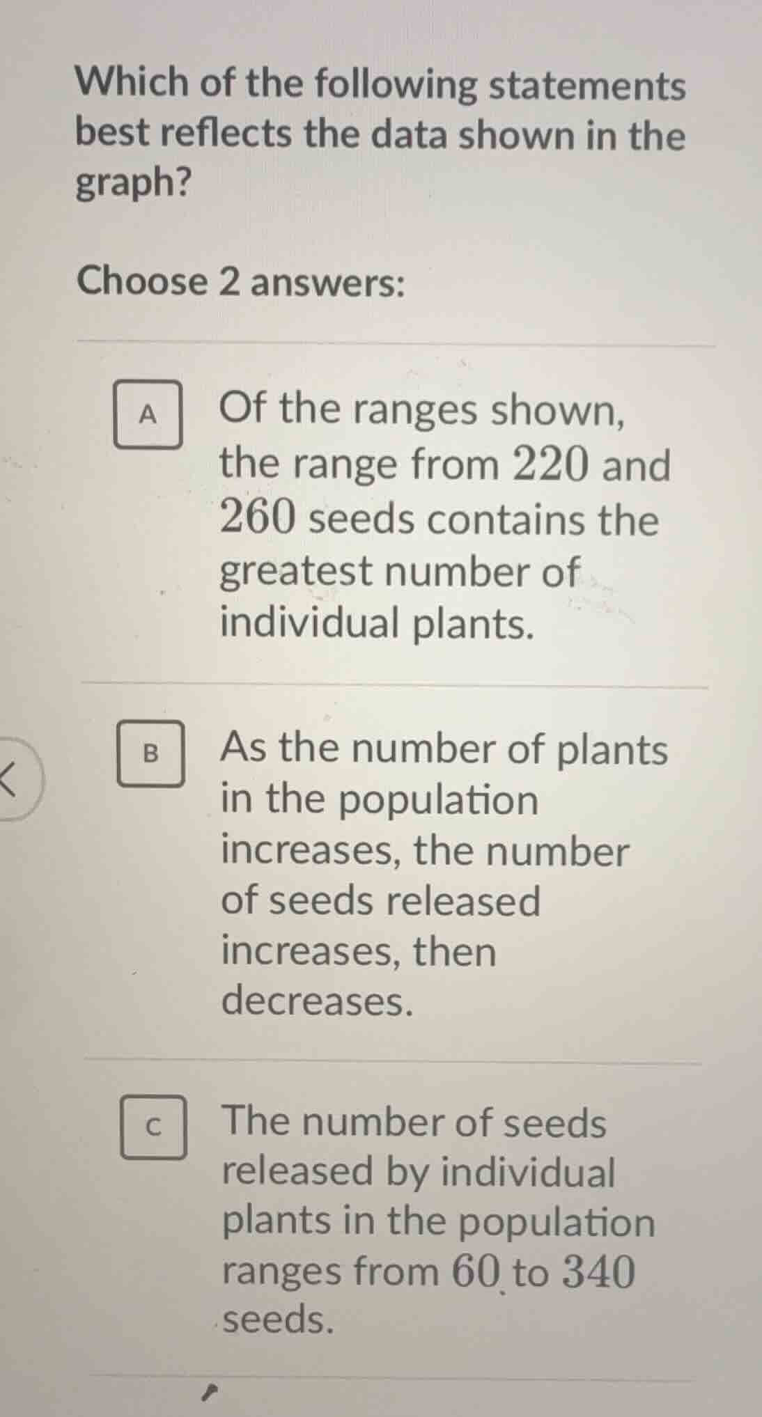
which of the following statements best reflects the data shown in the graph? choose 2 answers: a of the ranges shown, the range from 220 and 260 seeds contains the greatest number of individual plants. b as the number of plants in the population increases, the number of seeds released increases, then decreases. c the number of seeds released by individual plants in the population ranges from 60 to 340 seeds.
- For option A: In a typical seed - plant data graph (like a histogram or frequency distribution), the range with the highest bar (frequency) has the most individual plants. If the range 220 - 260 seeds has the tallest bar, this statement is correct.
- For option B: If the graph shows a trend where as the number of plants (or the x - axis variable related to plant count) increases, the number of seeds first goes up and then down, this statement holds.
- For option C: If the minimum number of seeds is 60 and the maximum is 340, then the range of seeds released is 60 - 340. But we need to choose 2 correct answers. Assuming the graph’s frequency distribution has the 220 - 260 range with the most plants (A is correct), the trend of seeds with plant number is increase then decrease (B is correct), and C may not be (if the min/max is different). So the two correct answers are A and B.

Snap & solve any problem in the app
Get step-by-step solutions on Sovi AI
Photo-based solutions with guided steps
Explore more problems and detailed explanations
A. Of the ranges shown, the range from 220 and 260 seeds contains the greatest number of individual plants.
B. As the number of plants in the population increases, the number of seeds released increases, then decreases.