QUESTION IMAGE
Question
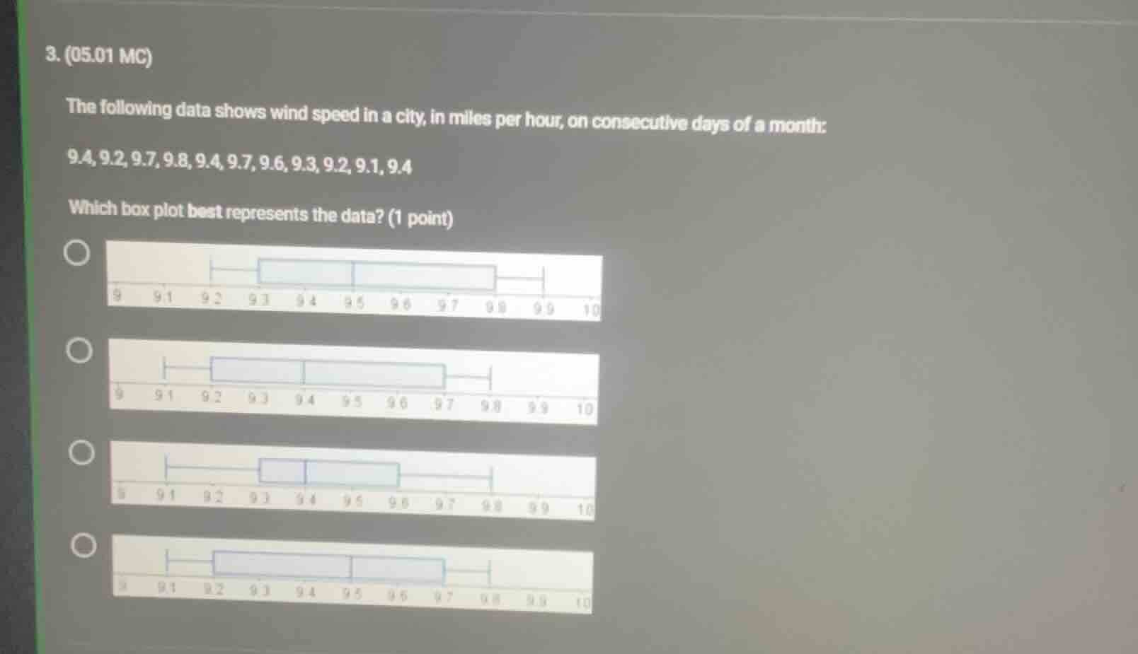
- (05.01 mc)
the following data shows wind speed in a city, in miles per hour, on consecutive days of a month:
9.4, 9.2, 9.7, 9.8, 9.4, 9.7, 9.6, 9.3, 9.2, 9.1, 9.4
which box plot best represents the data? (1 point)
four box plot options are shown, each with a number line from 9 to 10 with markings at 9.1, 9.2, 9.3, 9.4, 9.5, 9.6, 9.7, 9.8, 9.9
Step1: Sort the data set
Sorted data: $9.1, 9.2, 9.2, 9.3, 9.4, 9.4, 9.4, 9.6, 9.7, 9.7, 9.8, 9.9$
Step2: Find minimum value
Minimum = $9.1$
Step3: Find maximum value
Maximum = $9.8$
Step4: Calculate median (Q2)
For $n=12$ (even), median = $\frac{9.4 + 9.4}{2} = 9.4$
Step5: Calculate Q1 (lower quartile)
Lower half: $9.1, 9.2, 9.2, 9.3, 9.4, 9.4$, Q1 = $\frac{9.2 + 9.3}{2} = 9.25$
Step6: Calculate Q3 (upper quartile)
Upper half: $9.4, 9.6, 9.7, 9.7, 9.8, 9.9$, Q3 = $\frac{9.7 + 9.7}{2} = 9.7$

Snap & solve any problem in the app
Get step-by-step solutions on Sovi AI
Photo-based solutions with guided steps
Explore more problems and detailed explanations
The correct box plot is the second option: the plot with whiskers at 9.1 and 9.8, box edges at ~9.25 and 9.7, and median line at 9.4.